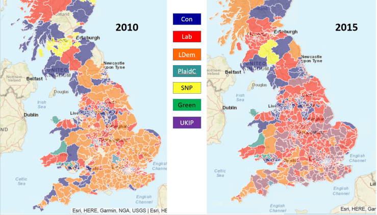
Brexit precursor – the rise of UKIP in the 2015 election, displacing the Lib Dems as runner-up.
A study was made of which party came second in the 2015 UK General Election. This was described in this post: Election 2017: Context with maps.
I’ve been meaning to repeat this exercise for a while because I was curious to see if UKIP was still the runner-up in the 2017, post-referendum election.
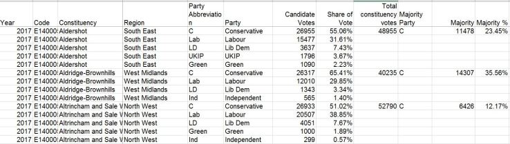
So I got hold of the requisite dataset from the Electoral Commission which was in a perfect format so imported into a cube without difficulty. The dataset looks like this:
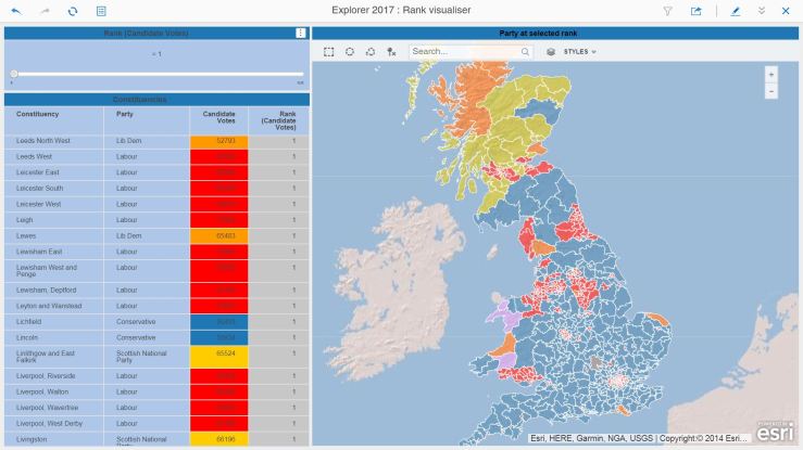
Once in a cube, it’s a simple matter to create a ranking metric based on Candidate Votes which can then be used to select, for all constituencies, the 1st, 2nd, 3rd and so on party.
A slightly more convoluted method to achieve the colour-coding for each constituency on the map, as the advanced threshold is not available when using ESRI maps. So a metric using a CASE statement provides a numeric value for each party, which is then used as a threshold to provide the correct colour.
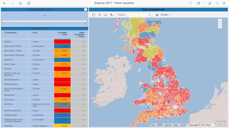
Here’s the map of the election winners:
It’s very blue… the countryside is Conservative. Interestingly, the Lib Dems appear to be popular in some coastal areas…
Let’s take a look at the South East:
Urban areas tend to vote Labour. Note the one Green MP in Brighton !
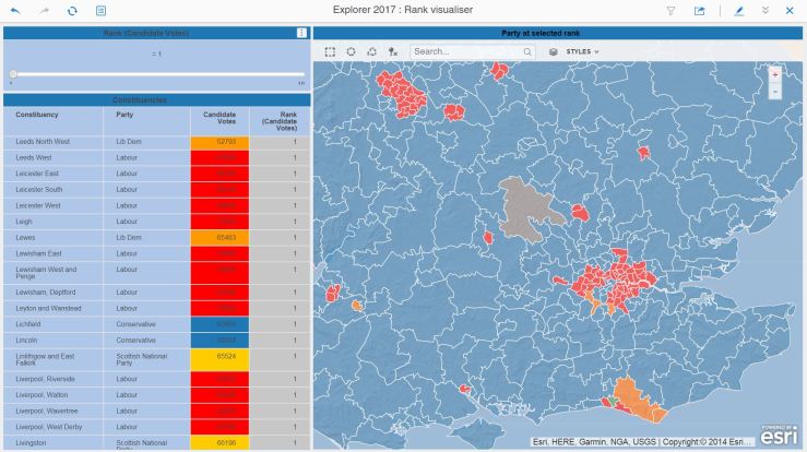
In 2015, UKIP came second in many constituencies. Will this be the case in 2017 ?
Lib Dems in the South West, Labour in the North and East. Only one constituency where UKIP cam second…
With, again, a look at the South East:
Where has UKIP gone ?
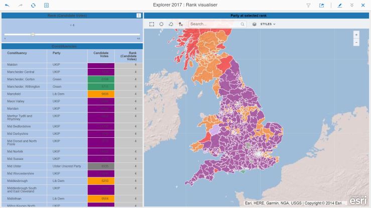
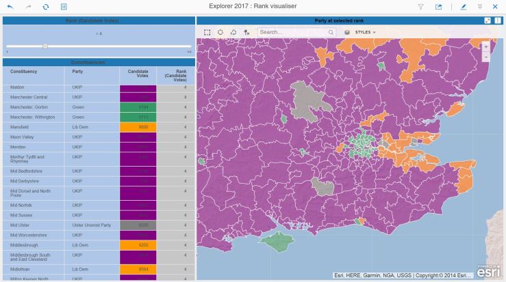
When looking at who came third, UKIP makes an appearance in the Thames Estuary constituencies. To avoid tedium, we’ll show below some maps for the fourth ranking:
UKIP is in fourth place pretty much everywhere.
Many of the rural constituencies have placed UKIP in fourth place. An interesting pheomenon occurs when you look at the cities:
Cities prefer Greens to UKIP for fourth place…
In a sea of purple UKIP, the cities stand out like beacons with their ranking of the Greens in fourth place.
So here you have it. UKIP recedes in the electoral consciousness post-referendum, with the traditional parties positioning themselves on city vs country and north/north-east vs south-east/south-west lines.
If only time permitted, we could enrich this with the candidate information, show the gaps between winner and loser to identify volatile constituencies and layer on top some local data to assess what issues might resonate locally. We could then look at focusing a party’s messages based on local priorities, hopefully resulting in increased votes. It’s totally possible and I have the data. I am just short of time…
The great Dacorum vehicle crime spike of Winter 2016
The Question
Or rather, questions:
Is there a relationship between a propensity to be a victim of crime ( a key domain in the Index of Multiple Deprivation data) and a combination of other, non-crime IMD domains, such as employment, income, education, skills, environment ?
and
Can a machine learning system be implemented to demonstrate and explore such a relationship ?
Commercial Interlude : As I am a consultant working for MicroStrategy, it is natural that I use this excellent software for my exploration. I assume that all the examples here might be repeatable with other tools, but I prefer to spend time on data wrangling and exploration with a system that I know and trust.
What is known
This article is inspired by a delve into predictive metrics conducted a few days prior to the writing of this article. The question posed was initially formulated to provide an exploration framework into the various predictive functions available at the time.
This early exploration provided some useful learning regarding the type of predictive metric, the methodology and the interpretation of the results. It partially answered the question, better success being achieved with clustering than classification.
In particular, the key learnings were:
In future, cluster all LSOAs (lowest level geographical units) by population density. One of the key findings was that densely populated areas were more successful at being accurately classified as having, or not having, a crime deprivation propensity.
The Random Forests algorithm appeared to perform best at classification.
The k-means algorithm did a good (understandable) job at clustering.
In future, train and score each LSOA population density cluster separately. A better classification performance is expected – will this be the case ?
What’s Next ?
Population Density
Population density must be a factor in determining a crime deprivation propensity. The classification performance of the initial exploration hinted at a strong relationship between high prediction success rates and high population densities. The density data exists but must be added to the current Index of Deprivation Dataset.
Careful Clustering
Using population density and other non-crime indices, a number (4 to 8) of LSOA clusters should be identified. The outcome of the clustering needs to be verified for appropriate groupings and the exercise must be repeated with different measures if necessary until the clustering is optimal. Understanding and measuring this optimal clustering in a recursive/iterative manner is possibly key to an AI implementation, but this may be beyond the scope of this new phase. I will continue to use k-Means for now as a clustering method.
Classification Choice
Having had a go at classification using Naive Bayes and Random Forests, I have emerged from this phase with more questions than answers. The difficulty is that the error rate fluctuates wildly, with both methods showing good score accuracy for some LSOAs and terrible for others. The decision lies between improving the existing methods, or trying out a new one. As the name of this blog indicates, this is all about discovery, so I will use the Neural Network R function to score my LSOA cohorts, clustered by the previous exercise.
Progress so far
Kmeans based on population density was run and persisted, then added to the main IMD dataset as a permanent segmentation. The clustering was checked out and appeared to make sense based on the metrics used (education, income, employment and population density):
Dossier showing the clustering results for selected Local Authorities.This grid exports all 24000-odd LSOAs, which are then written back to the IMD database (manually, for now).
Next, pairs of datasets (training and scoring) need to be prepared for each of the four clusters, and their accompanying dossiers:
Here is the Neural Network metric:
I am currently working on cluster 1 to verify the mechanics of training and scoring. The areas I am looking at are:
Number of neural network layers
Selection of training dataset ( ideal percentage of the total dataset, selection of random LSOAs).
Understanding why, once I had taken population density out of the set of metric variables, the scoring success rate went from 60% to 91-94%.
Presentation, formatting and visualisation improvements
When this is done, the cubes and dossiers will be replicated for all remaining 3 clusters.
At this precise moment, however, the findings are interesting enough. A scoring success rate of 91-92%, depending on the number of network layers, is a very big improvement on the initial investigation I carried out with kMeans (no population density) and Naive Bayes.
It’s worth rewording the above paragraph to understand what the neural network approach tells us:
Using clusters based on population density, income, crime, employment and education deprivation scores, for the first cluster tested, it was possible in 91-92% of cases to predict a propensity to be a victim of crime based on income, employment and education indices.
I find this pretty encouraging for a first pass at this particular R function. However, this means an error rate of 8-9% which, if used in real-world impacting applications, could prove to be unacceptable.
Understanding why the scoring errors are happening is, in itself, an interesting discovery process. Discovery means Dossier, of course;
The orange bubbles are LSOAs where the scoring missed. The stats and the map help to give insight on why the scoring error occurred
This cluster was the smallest. What will the success rate be on a larger cluster ?
A quick attempt produces the results below, after duplicating the cubes and dossiers, editing the cube queries, repointing the dossiers to the new cubes and saving the neural network parameters to a separate file.
Blessed be the ‘Suspend Execution’ feature of 10.11 ! This allows important edits to be done so that the Dossier has the correct dataset and parameters to address a new cluster.For cluster 2, we enjoy a similar success rate of 94%.
94% in training looks promising. A slightly worrying result is the scoring on the full dataset, which drops to 90% (still good but not optimal).
There is a loss of accuracy when scoring larger datasetsLet the exploration begin !
A point to note here – it’s taking me far longer to write this article than it took to create the datasets and dossiers. All the tech is working just fine, and I suppose my knowledge of MicroStrategy and generally throwing data about mean that I can get from idea to result in a very short time.
Conclusion (For now)
Do you remember the questions posed at the beginning of this article ?
Is there a relationship between a propensity to be a victim of crime ( a key domain in the Index of Multiple Deprivation data) and a combination of other, non-crime IMD domains, such as employment, income, education, skills, environment ?
and
Can a machine learning system be implemented to demonstrate and explore such a relationship ?
In my humble opinion, the answer is yes to both questions:
Using neural networks, it’s been possible to predict a crime propensity for, so far, about 90-91% of LSOAs. Such an outcome would be of value for a general classification, but for larger clusters an error rate of 10% is a large number of cases which would prove problematic in fields such as medicine or other sensitive domains.
A series of datasets (in-memory cubes) and dossiers provide the building blocks for an automated scoring application. Quite a bit more work to be done, including writing back to the IMD database and designing workflows in System Manager.
It should be possible to improve this success rate. This relies on the study of the scoring errors, in particular looking at any edge cases and tuning the training data selection and the sensitivity of the boolean crime indicator used as the network target.
Looking ahead
Assuming I manage to complete the work on this, I will use actual crime data at my disposal for each LSOA to verify whether:
The IMD crime deprivation measure reflects the crime reality,
The scoring is closer or further to reality than the IMD measure.
In addition, and to keep up with the trend for AI and automation, I can see the value in pointing an intelligent construct at a bunch of tables and letting it do the parsing, clustering and classification on all possible combinations of data items and all results, highlighting the most promising ones, for human discovery and analysis. There seems to be a lot of donkey work in machine learning – automating the data preparation and scrutiny should shorten the time to insight considerably.
Hopefully more news about this soon. Or I may be diverted on another path, you can never tell…
Data science and machine learning are all the rage now – but it’s funny to think that MicroStrategy has had predictive metrics for as long, if not longer, than the 10 years I have been at the company.
Looking back at all the projects I have worked on, I am pretty certain that we never got round to using predictive metrics in anything other than an interesting exercise when project pressures permitted.
I would put this down to the early (or lack of) maturity of the data and analytical ecosystem, where getting the fundamentals right – to understand what happened in the past – was enough of an achievement without complicating the issue by trying to look forward. Another factor was the relative complexity involved in deploying predictive metrics until R integration came in to play.
Now, with a good mix of data knowledge and software capability, it is becoming possible to consider machine learning and data science as part of a analytical offering. I can see this happening at my customers, and I am also at this stage with my Social Explorer project.
The Social Explorer
I’ve been building up for a while a set of data relating to demographic and societal measures for the UK as a whole, and also down to local geographical subdivisions. Those are:
Local Authority (LAD): Representing a local government area
Lower-level Super Output Area (LSOA): A census area representing on average 1000 to 2000 people.
Constituencies: A political division that returns a member of parliament
These geographical subdivisions are the backbone of my social explorer project, permitting me to join all manners of interesting data sets:
Index of Multiple Deprivation 2015 study (by LSOA)
Crime data by month by LSOA
Health related data, by LSOA
Ethnic data, by LSOA
Migration data, by LSOA
Referendum result, by LAD
Election results, by Constituency
I make extensive use of maps, and have created a number of custom ones that allow me to show measures by area (LSOA, LAD, Constituency).
Putting it all together, I have a number of applications that have helped me understand the EU referendum, the 2015 election, the rise of crime in the last few years and many other useful offerings.
Has it had any value ? I think so. First, it’s been essential in helping to learn about the new features of the frequent MicroStrategy releases. Then, it’s also a useful way to find out the most efficient patterns that would help a similar application move from the exploration phase to the exploitation phase. And finally, it’s permitted me to verify, and sometimes anticipate, current affairs stories where data or statistics play an important part.
Predictive exploration
I’ve now acquired a good knowledge of all the data I have used for this project. Throughout the discovery, I’ve often found that an endless series of questions can be asked of the data once you see a pattern or an interesting anomaly develop.
For the purpose of this article, and my initial foray into this field, I am asking two questions:
Is it possible to classify all the LSOAs within a LAD to gain an idea of the quality of life in each LSOA ?
Is it possible to predict an LSOA’s propensity for high crime deprivation based on other measures ?
Spoiler alert: I’ve not yet reached the point where I can answer these questions with absolute certainty. This is an exploration, and whilst the technology is definitely there, a fully successful approach to the problem requires iteration and experience…
Looking at the available documentation, and equipped with the R integration pack (installed seamlessly as part of the 10.11 upgrade, thank you MicroStrategy), I decided to tackle each question thus:
The quality of life question will be explored by the use of the k-means R function.
The propensity for crime will be explored by using a Naive Bayes R function.
The seasoned data scientists amongst you might scoff at my choice – the documentation itself refers to these functions as not the absolute best for the problem. Still, this is a discovery process and you have to start somewhere.
K-Means
According to the documentation:
k-Means clustering is a popular clustering algorithm that groups items into k distinct clusters so that items within the same cluster are more similar to each other than items within different clusters.
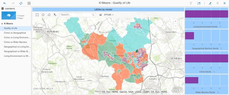
That looks like it will do the job. Having built a data set in a Dossier, placing the LSOA code and a number of pertinent metrics, the next task is to create the predictive metric.
The screen shot below shows the metric, and the data set components.
This metric calls an R function which returns a cluster value (1 to 4 in this case, you can set the metric to decide how many clusters are optimal) grouping the LSOAs according to their similarity. Below you can see a map of the area, with each LSOA shaded based on the value returned by this metric:
I have selected the area where I live (dark green on the map) and you can see the four metrics that I have used as parameters to the k-means function. The dossier then allows you to click on different LSOAs and verify that the clustering makes sense. You can then see that cluster values do indeed group LSOAs that have a certain profile from the combination of the four metrics.
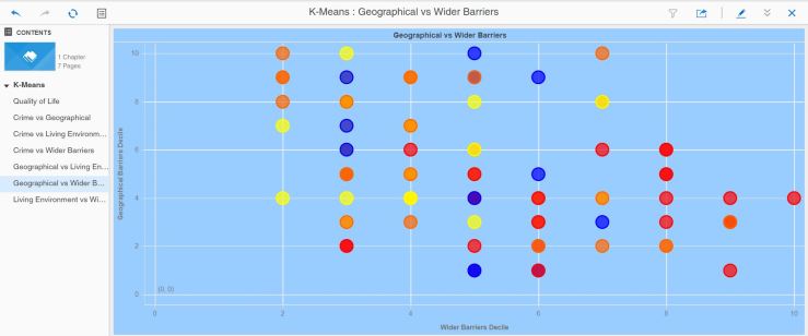
I wanted to find out more about how the algorithm went about its classification, so I created a series of bubble charts showing for pairs of metrics the LSOA, coloured by cluster value.
Some combinations of metrics seem to be aligned to the clusteringSimilar clustering to the previous combinationWhilst some other combinations are less obvious
Job done, in my opinion. Or is it ? Are there other measures that can be used to better cluster these LSOAs ? I referred earlier to the iterative nature of the discovery process – given more time, I would do just that – run this for many or all of the possible metric combinations.
What can this be useful for ? Answering the quality of life question, I can now propose a classification of LSOAs according to quality of life type and ‘flavour’ (moderate crime, great living environment and so forth).
I also suspect that this might have value as a precursor step to the next challenge, the prediction of crime propensity based on certain measures.
Naive Bayes
Again, according to the documentation:
Naïve Bayes is a simple classification technique wherein the Naïve assumption that the effect of the value of each variable is independent from all other variables is made. For each independent variable, the algorithm then calculates the conditional likelihood of each potential class given the particular value for that variable and then multiplies those effects together to determine the probability for each class. The class with the highest probability is returned as the predicted class. Even though Naïve Bayes makes a naïve assumption, it has been observed to perform well in many real-world instances. It is also one of the most efficient classification algorithms with regard to performance.
This is slightly more involved. It requires a training metric, that prepares a scoring model, and a predicting metric that uses the model to score a larger data set.
Let’s look at these metrics:
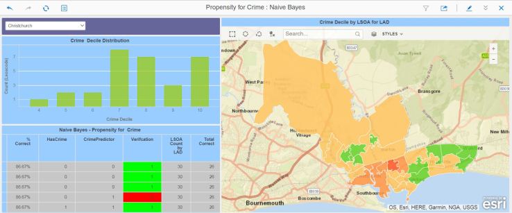
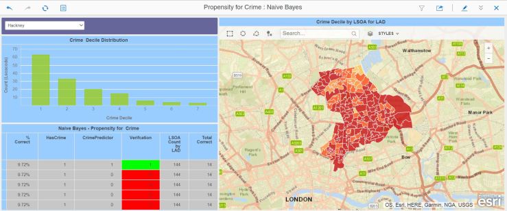
Above is the training metric. The data set is the Index of Multiple Deprivation database entries for Dacorum, the local authority where I live. I will use this dataset to train the metric. The metric HasCrime is a boolean metric that is 0 if the crime decile is 6 or above (1 is bad, 10 is good), otherwise it’s 1. This metric is used to train the model which will return its score based on the other metrics used here. When the dossier is run, the training metric will score each LSOA and write the model back to a file that the predictive metric to score a wider data set.
Below is the predictive metric. It looks very much the same, except for one value switching the training off. The metric will now use the file containing the model and score the dataset, which in this case is the full list of all LSOAs in England.
We now have a training dossier, and a predicting dossier. Below is the training dossier – I’ve added a metric that checks the correctness of the scoring.
And here’s the predicting dossier. It shows a distribution, for the selected local authority, of all the LSOAs by Crime Decile (remember, 1 is bad, 10 is good).
In this case, we’ve got quite a good score match – the model predicted correctly for 86% of the LSOAs. However:
For this local authority, the model got it completely wrong ! Cycling through the local authorities, I noticed that the scoring success was variable, ranging from appalling to very good, and there appeared to be a relationship between the decile distribution and the scoring accuracy.
Conclusion
I have been able to create these predictive metrics and their accompanying dossiers quickly and without difficulty. As a result I have managed to provide an answer to both my questions. I am unsure whether the answers are correct, though. The k-means method appeared to cluster the LSOAs in an understandable way.
The Naive Bayes method requires more work – the number of misses would make it extremely dangerous if used in an AI/Machine learning scenario. It’s possible that you need to cluster all the LSOAs, and then train and score each cluster individually to improve accuracy. It’s highly possible that the wrong scoring metrics have been used, as well.
So it’s a partial success – far more permutations of clustering and scoring metrics need to be tried to increase the accuracy of the model. Still, early days…
I’ve got the good fortune of working for a very very excellent analytics company, and thus I get to use some really powerful software to indulge my love of data analysis, with maps if possible.
Over the months, I have developed some dashboards treating subjects such as health, deprivation, electoral analysis and prediction, crime and other demographic data. These have used custom maps and lately have started to employ R functions.
Throughout this building period, I have taken my project and its software through many upgrades on my laptop – and I also have a Linux VM which I keep in sync version-wise.
I have been pleasantly surprised at the complete lack of any issues. The software is solid and once I finally learnt to backup my plugins folder every custom aspect was preserved and all my dashboards (now called “Dossiers”) work.
Whilst checking my dashboards, I thought I would showcase a few of the apps that have gone through so many upgrades, and which have given me some very useful information.
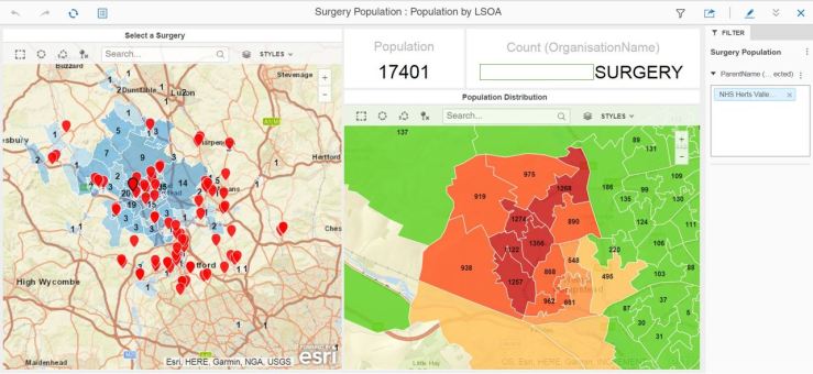
Surgery population analysis – filter by CCG then pick surgery from the map to look at population distribution by LSOACrime Explorer for my local areaAge turnout simulator for general electionR integration tester – needs more work 🙂And now with MapBox – fast vector graphics…
I hope to return soon with more interesting data sets and data stories.
We live in interesting times. Not that I want to depress you, but everything is accelerating rather faster than I’d like. Take crime, for instance – the news in the UK report a big increase in violent crime. I seem to have a knack of working on data, only to see a few days later a story in the press that addresses the very story that I was researching.
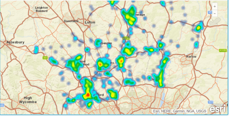
See below, a quick visualisation of crime in my home town of Hemel Hempstead:
It is, of course, a work in progress – but it shows, in the cluster pies, the number of crimes recorded in the last year up to November 2017. The Crime Type pie has a segment selected that shows violent crime, and, indeed, it has increased steadily over the course of the year. Sadly, the outcome pie’s biggest segment for all categories is “No suspect identified”.
I am also an active member of a Facebook page for residents of my town. My fellow Hemelites are very concerned by crime, as there are countless thefts occurring all the time (more serious crimes don’t make it on the page as they are usually embargoed by the police).
Being an avid science fiction reader, I have read countless stories about solutions to this problem. Here’s one possible scenario:
“The town is monitored by a pervasive network of sensors and cameras. Each citizen is equipped with a device that helps locate an identify them at any time. The camera and sensor network is supervised by an Artificial Intelligence that works out who is where and doing what. The key with AI is that it learns to identify patterns which are out of the ordinary. Such patterns can trigger the attention of the police, whose much reduced numbers through spending cuts are far better utilised when investigating suspicious events that the ever-watchful AI has identified.
The monitor AI also identifies persons who do not carry a device, or who do not fit the profile of the usual device carrier. This, again, triggers the attention of the police who can then either send the person on their way out of the town boundaries, or issue them with a ‘guest’ device to comply with the monitoring system.
In the event of a crime, the AI can produce movements and locations of all persons present at the location.”
Science fiction, yes ? Well it might have been ten or twenty years ago. It so happens that I could put together a technical solution consisting of smartphones, cameras and sensors, Artificial Intelligence programmes and an identity tracking system like MicroStrategy’s Usher that would do just that.
It’s Big Brother, yes ? But if we have a society where the police is in retreat, I’m not sure I prefer the Mad Max alternative.
As with all supervisory systems, human or machine, the key is this: Who watches the watchers ? That’s for us to solve. But I believe my solution would reduce crime considerably. Should I write to my MP and propose this ?
I had a vague plan of using available electoral data and youth vote predictors from YouGov to model the impact of an increased youth turnout. I have done the work for this but have not published it yet because I need to work on the model and the calculations.
Also, I’ve been on holiday and then rather busy with my current customer.
Thinking about it, once I have my prediction engine up to scratch (no easy task), I would really like to try and model the impact of a 70% youth turnout in the EU referendum. I’m pretty certain we’d be having different conversations !
I’ll say no more because I do not want to launch into a political rant – this blog is not the place for such writing.
First, a brief message to all those affected by the events in London this week-end. Our thoughts are with you.
When it comes to age in elections, we often hear that older people tend to vote more. One question that poses itself is: “What would happen if more young people voted ?”.
I am not answering this question in my post – there is a more in-depth piece of work coming. But I am trying to set the scene for the investigation.
First element: Is it true that older people vote more ?
According to the FT, it is:
A very worrying factor in the above article is that the turnout in age group 18-24 has collapsed since 2010, with participation at 30% in the EU referendum.
The turnout for other age groups rises steeply with the age 65+ achieving 80% turnout.
You often hear millennials blaming baby-boomers for the state of the world ( I know mine do). But the very poor turnout shows that young Britons have surrendered the control over their future to voters in late middle-age and above, who are shaping the decisions taken by government.
Second Element: Does age influence your voting decision ?
The article states strong tendencies for younger people to vote Labour, with older people voting Conservative. The crossover point is around age 34 – before, more Labour voters, after, more Conservative.
If you look at a political map of the UK, it’s pretty blue all the way, with a concentration of red in the cities. Curiously enough, there are more young people in the cities than there are in the countryside.
So as a young person, you will not be able to shape your future until you and your age group go out and vote.
How can we attempt to verify this ?
We have to go to work on the data.
I am going to use the FT data as an anchor point and assume that the data is correct. I will then model, based on population estimates, the likely number of votes per LSOA that would go either to Labour or the Conservatives. All being well, I should be in a position to tune, in the data or interactively, the turnout for a given age group, or their voting intentions. Finally, I will compare that with the 2015 election results and see whether my investigations confirm or deny YouGov’s assertion, and what youth turnout it would take to change the result.
(Commercial Message)
I will, of course, be using MicroStrategy’s peerless data wrangling and exploration capabilities. I plan to use 10.4 initially, migrating to 10.7 for sharing and map layering.
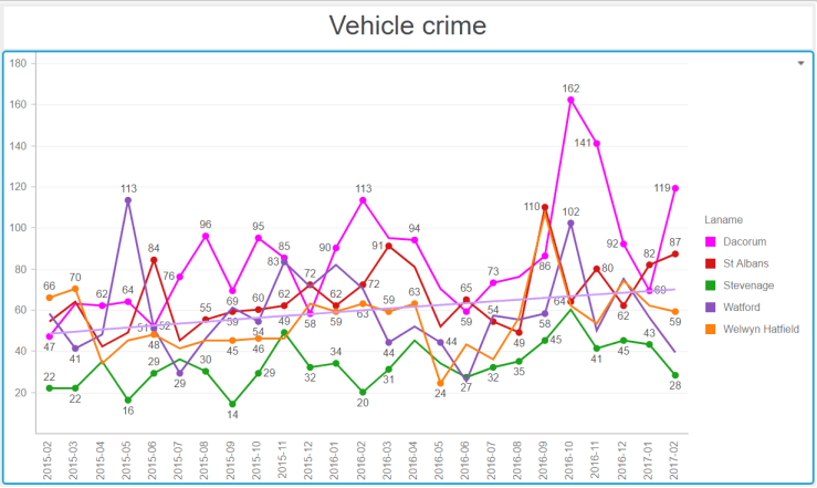
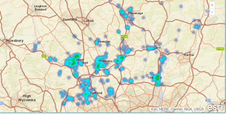
As discussed in my previous post, I thought it would be useful to see how crime in Hemel and Dacorum compared with other key towns in Hertfordshire. For this part of the study I chose St Albans, Hatfield, Welwyn, Watford and Stevenage.
I wanted also to see if the crime numbers reported by the police were static over time (unlikely), and if there was a trend of higher or lower criminal events.
There is a small problem with this study – does a rising number indicate a higher number of crimes, or simply that the police are more efficient in responding and reporting such events ? That’s a question we need to ask our police commissioner, and our MP.
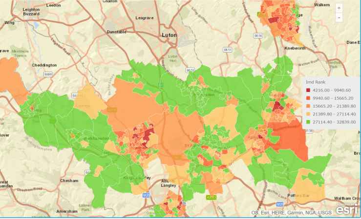
Let’s start with a view of the Index of Multiple Deprivation over the towns in the study:
Here, the colour red indicates high deprivation.
No real surprises here, areas of most towns are highly deprived (St Albans less so) and countryside areas show the least deprivation.
Now we look at the incidence of certain crime types in February 2017:
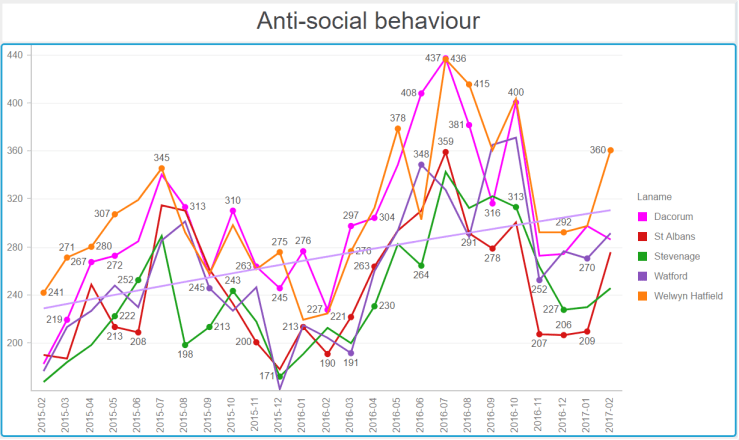
Antisocial behaviour
In February 2017, Watford, St Albans and Hatfield had a higher concentration of antisocial behaviour.
Vehicle Crime
Hemel Hempstead has a higher incidence of vehicle crime.
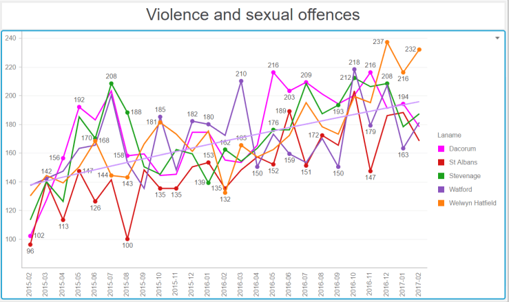
Violence and sexual offences
Watford and Hemel are top of the league…
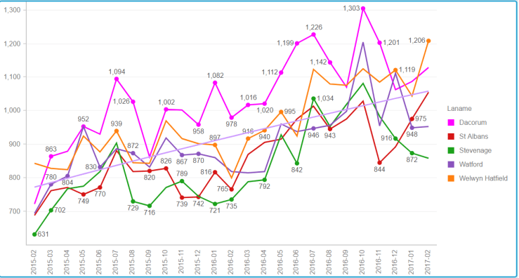
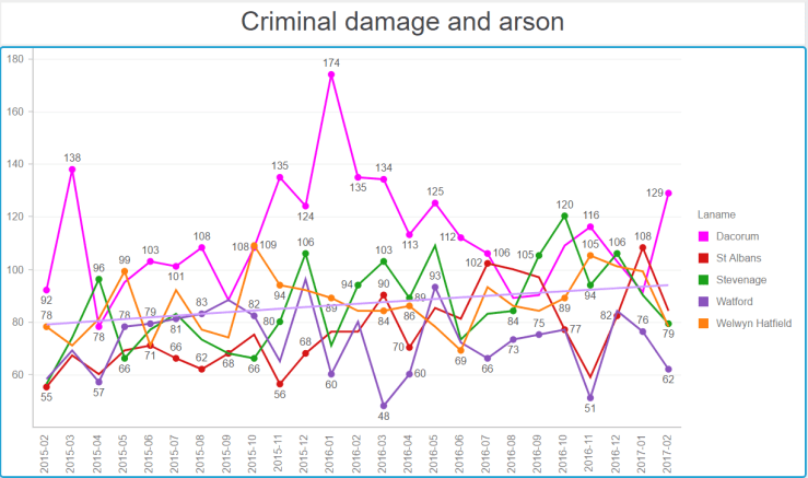
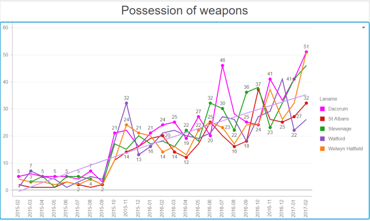
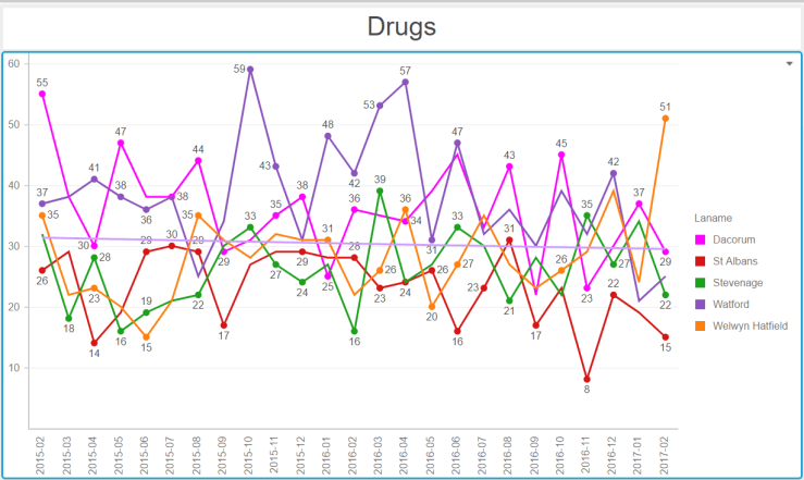
Now the series of graphs below require some explanation. They show, for number of big towns in Hertfordshire, the crime numbers by category over 24 months (February 2015 to February 2017). To help put our town in perspective, I have represented the line for Hemel in shocking pink. The horizontal line on each graph shows the general trend over time. They all go up…
All categories of crime.
Alarmingly, Hemel seems to be at the high mark for the total number of crimes.
Note the seasonality. Being antisocial requires warmer weather.Blimey Hemel ! What happened in winter 2015-2016 ?Are we tooling up for an invasion or something ? Or is the police reporting things differently ?Hemel Hempstead, vehicle crime capital of HertfordshireA generally low number of drugs offences, with a slow downwards trend.A worrying upwards trend for all towns.
And there you have it. In almost all towns, we have increasing crime numbers in all categories being reported by the police. What does this mean ? Does this mean the police are more efficient at detecting and reporting crime ?
Crime affects us all – I wonder what our MPs have to say about this ? Why is it on the increase?
I happen to be, on Facebook, member of two groups: One about Brighton, where I first arrived in the UK in 1984, and one about Hemel Hempstead, the town where I have lived since 1993. You could not think of two more different places. Brighton is lefty, deprived and interesting, whilst Hemel is quite conservative, relatively affluent and hard-working.
The Facebook pages reflect this. On the Hemel one, people are regularly complaining about bikes and scooters being stolen, along with regularly heated debates between the Conservative, DailyMaily, Flog’em and Hang’em members and the small but resolute core of Left-leaning, liberal people. It’s a great way of looking beyond your ‘bubble’.
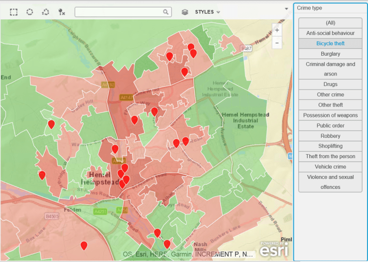
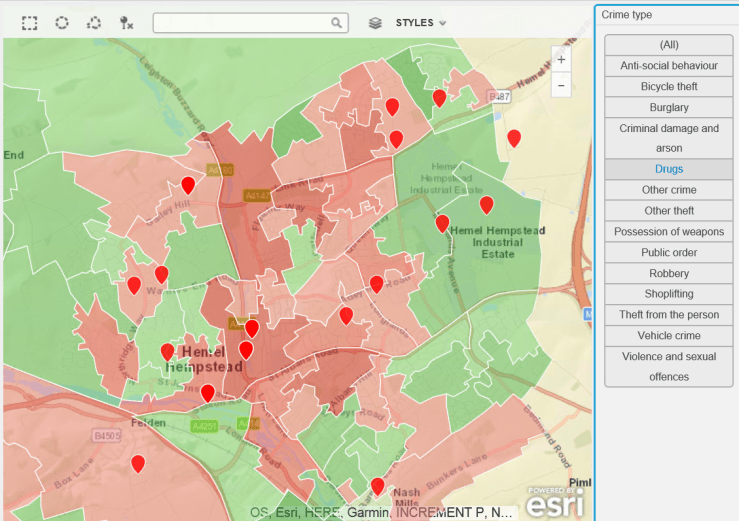
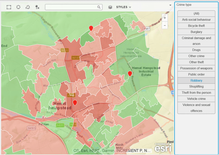
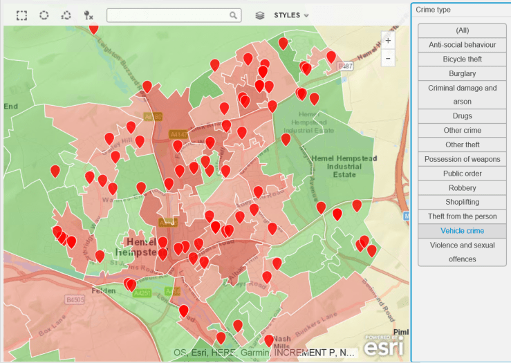
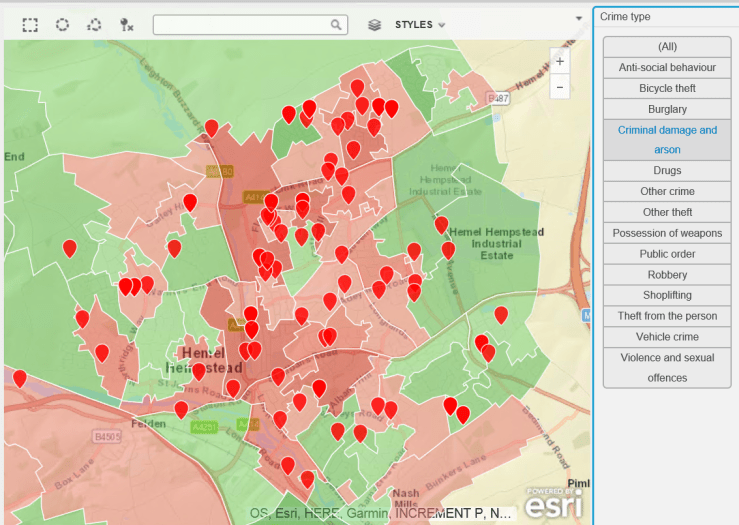
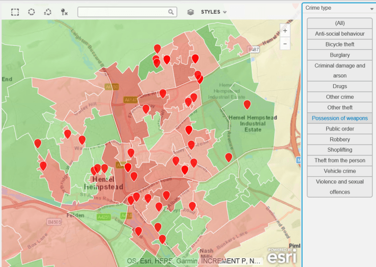
The rather frequent complaints about bike thefts led me to procure some crime data – a great repository of this exists at data.police.uk, so i thought it would be useful to plot this on a map and see if there is a problem with bike theft in my hard-working, nuttily conservative town. As a background canvas, I am using deprivation data to identify areas which are more or less subject to crime, according to the Index of Multiple Deprivation data for 2015, which can be found here.
The data is for February 2017. The background deprivation colour scheme goes from green (no big issue with crime) to red (rather more crime).
Do you think bike theft is Hemel Hempstead’s biggest crime issue ? Let’s see…
Bike Thefts. Some, but no epidemic…Hard-working little town – no time for drugs (or very good at not getting caught).Robberies are not an issue, apparently.Having two more wheels than a bike increases criminality. Vehicle crime is more prevalent.Ah. A bit more serious, criminal damage and arson. Not so good.Rather too many weapons for my liking.This is no laughing matter. What is going on ?
And there you have it – a snapshot of the criminal landscape in the town where I live. As usual with such investigations, many questions arise:
How does that look plotted over time ? (I have the data, watch this space).
What does my MP think about it ?
Why are there clusters of violence in certain residential areas ?
How does my town compare to other similar towns ?
How does the police cope with this workload ? It’s a lot of crime…
Finally, should this be an election issue for the people of Hemel Hempstead ? According to the Facebook page and the local paper, it’s all about bad parking, bike thefts and foxes in gardens.
More maps and questions to come, I think.
(Commercial Message 🙂 )
I have used, as promised, the excellent map layers feature of MicroStrategy 10.7. The background deprivation layer is based on Local Super Output Area (Census sub-division) shapefile, the crime layer uses the February 2017 data from the Hertfordshire Constabulary).


You must be logged in to post a comment.