Social Explorer Project: An upgrade and a showcase

I’ve got the good fortune of working for a very very excellent analytics  company, and thus I get to use some really powerful software to indulge my love of data analysis, with maps if possible.

Over the months, I have developed some dashboards treating subjects such as health, deprivation, electoral analysis and prediction, crime and other demographic data. These have used custom maps and lately have started to employ R functions.

Throughout this building period, I have taken my project and its software through many upgrades on my laptop – and I also have a Linux VM which I keep in sync version-wise.

I have been pleasantly surprised at the complete lack of any issues. The software is solid and once I finally learnt to backup my plugins folder every custom aspect was preserved and all my dashboards (now called “Dossiers”) work.

Whilst checking my dashboards, I thought I would showcase a few of the apps that have gone through so many upgrades, and which have given me some very useful information.

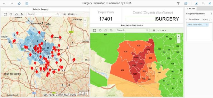
Surgery Population Anon
Surgery population analysis – filter by CCG then pick surgery from the map to look at population distribution by LSOA
2018
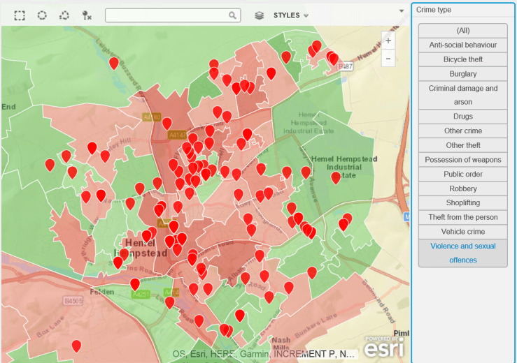
Crime Explorer for my local area
Election Predictor
Age turnout simulator for general election
KmeansDacorum
R integration tester – needs more work 🙂
MapBox
And now with MapBox – fast vector graphics…

I hope to return soon with more interesting data sets and data stories.

About Corporate Value Systems

First of all, I want to apologise for two things: First, I have not written much for a while.  2018 has been a tumultuous year on the family front so far, and with a big hairy project in full deployment at work, I have simply not had the time to write or work on my data ideas. Then, I have also been distracted by shiny things: Building a robot and working on a simulation of an artificial mind. Be reassured – the former simply wanders about under my control and bumps into furniture, the latter is still a mind map which I use to model human behaviours such as drive, sociopathy and depression. So Skynet is not happening at my house. Yet.

The second thing I want to apologise for is that this post is not at all about data, but it’s more about corporate value systems. This is because I have seen recently some irritating, sycophantic posts on LinkedIN with people sharing some great words of wisdom for CEOs and other industry luminaries, such as:

“Always behave with integrity”

and

“Be true to your values”. Great words indeed, and statements of the blinding obvious. I’m sure these words tick the ‘I’ve given great leadership there’ box. I wish I had the necessary attributes to be a great CEO so that I could come out with a phrase like this and have it shared on social media, as if I were the Dalai Lama or whatever. I’d probably say ‘Try not to be an arsehole’, I think that’s advice that many people should follow more.

Anyway, back to corporate value systems. These have replaced the ‘Mission Statement’ that became prevalent in the 80s and 90s, in order to focus your workforce and your management on a definite and pretty obvious goal.

You may be preparing yourself for a long cynical rant about value systems, but I actually think they are a great improvement on the mission statement, as instead of giving you a single goal they provide instead a behaviour framework that should, if well designed, implemented and followed up, help an organisation adapt to rapid change – an evil of our times – whilst not losing sight of what is important in most human endeavours.

Did I mention the word ‘sycophantic’ above ? Well, I’m afraid i could be accused of this myself, as I am about to give praise to the value system that my employers came up with. I won’t tell you what it is, it may be copyrighted or it may give others a competitive edge.

But it is one that I remember well, and which I use to evaluate my decisions, communications and interactions with my  managers, colleagues and customers. It doesn’t ask the impossible, it does not ask you to become a different person, and its tenets are attainable by all who participate.

What is this value system made of ? It consists of five attributes (of course, we’re an Analytics company), each of them having one or two statements that give context and guidance to them. And, in communications from the Executive team downwards, initiatives are qualified in terms of one or more of these core tenets. It’s interesting to note that in my conversations with my colleagues, we often intersperse these very key words in what we say, and while we might find this amusing, it also influences how we say and do things.

Of course, value systems are nothing new – simply consider the 10 Commandments, or the Scout Promise, and you’ll agree that they’ve been around for a while. You will also agree that frequently, the tenets of these value systems are at best ignored and at worst violated or perverted to generate some pretty egregious behaviours. Thus, after a while these systems go stale until a fresh face or voice gives them a cleanup and reinvents them.

What does it matter if it’s not a new idea ? It’s still a great one. Corporations frequently have innovation spasms, the outcome of which are often dropped and forgotten, or replaced by the next new shiny concept.

But in my company’s case, I hope this particular initiative sticks around, and that our leaders do not tire of it. I think they’ve got the balance right, there, and I thank them for it.

Interesting times and a possible, if dystopian, solution to crime

We live in interesting times. Not that I want to depress you, but everything is accelerating rather faster than I’d like. Take crime, for instance – the news in the UK report a big increase in violent crime. I seem to have a knack of working on data, only to see a few days later a story in the press that addresses the very story that I was researching.

See below, a quick visualisation of crime in my home town of Hemel Hempstead:

2018.PNG

It is, of course, a work in progress – but it shows, in the cluster pies, the number of crimes recorded in the last year up to November 2017. The Crime Type pie has a segment selected that shows violent crime, and, indeed, it has increased steadily over the course of the year. Sadly, the outcome pie’s biggest segment for all categories is “No suspect identified”.

I am also an active member of a Facebook page for residents of my town. My fellow Hemelites are very concerned by crime, as there are countless thefts occurring all the time (more serious crimes don’t make it on the page as they are usually embargoed by the police).

Being an avid science fiction reader, I have read countless stories about solutions to this problem. Here’s one possible scenario:

“The town is monitored by a pervasive network of sensors and cameras. Each citizen is equipped with a device that helps locate an identify them at any time. The camera and sensor network is supervised by an Artificial Intelligence that works out who is where and doing what. The key with AI is that it learns to identify patterns which are out of the ordinary. Such patterns can trigger the attention of the police, whose much reduced numbers through spending cuts are far better utilised when investigating suspicious events that the ever-watchful AI has identified.

The monitor AI also identifies persons who do not carry a device, or who do not fit the profile of the usual device carrier. This, again, triggers the attention of the police who can then either send the person on their way out of the town boundaries, or issue them with a ‘guest’ device to comply with the monitoring system.

In the event of a crime, the AI can produce movements and locations of all persons present at the location.”

Science fiction, yes ? Well it might have been ten or  twenty years ago. It so happens that I could put together a technical solution consisting of smartphones, cameras and sensors, Artificial Intelligence programmes and an identity tracking system like MicroStrategy’s Usher that would do just that.

It’s Big Brother, yes ? But if we have a society where the police is in retreat, I’m not sure I prefer the Mad Max alternative.

As with all supervisory systems, human or machine, the key is this: Who watches the watchers ? That’s for us to solve. But I believe my solution would reduce crime considerably. Should I write to my MP and propose this ?

The Reality Gradient

Analytics is the particular branch of IT that I exist in. Here, change is the norm and technologies are rapidly evolving.

This means that a project may well start in a particular shape, and end up in a completely different one. And this may be perfectly acceptable to your client, which is an interesting paradox if you compare analytics projects to, say, a home improvement project. If I am having my kitchen changed, I’d quite like it to be a kitchen at the end of the project. But that is not necessarily the case with an analytics project.

Why is this ? Well, to continue with the kitchen analysis, we’ve been cooking food for almost as long as we have existed as a species. Analytics, on the other hand, is for ever new with knowledge, skills and outcomes that have to be discovered and implemented.

I have noticed, over the course of many – many – such projects, that the implemented vision is frequently different from the planned one. This is because, through the pretty amazing tools provided by my esteemed employers, new things about the enterprise are learned during the data discovery process, and business priorities may change over time. It then becomes important to seize opportunities and adjust the business case, and thus the outcome.

This difference between the vision that underpins a project at the start, and the end result is what I call the Reality Gradient. It is a key concept from a consulting point of view, and it can be expressed as a measure. As an analytics consultant, you will need to be the lead or a key participant to steer the project and the client through uncharted waters. Defining this gradient as a measure can simply be a ratio of initial expectations matched against project outcomes. The fewer the matches, the steeper the gradient.

As with all measures, few are significant on their own. In this case, you also need to have  a measure describing project success. This is more qualitative, in that it matches benefit expectations at the start (the business case) with benefit outcomes (if any).

Now that you have two measures, you have means of learning quite a bit about the people, the enterprise and the methods employed during the course of the project. Put simply, a high-gradient, high success project indicates agility and opportunity, while a low-gradient, high success outcome validates estimating, project leadership and indicates pre-existing knowledge (or immense luck).

If we accept that a Reality Gradient is inevitable, then we need to make sure that the journey is survivable. It is another paradox of agile methods that these are supported by very basic skills, even if these are applied in new ways. It’s worth doing a brief excursion into one of these core skills: Project management.

It is my experience that, across the many technologies and methodologies I have encountered, a key factor with low outcome projects has been a project management deficit. This can take two forms: Quantitative – there is not enough project management – and qualitative, where there is project management but it is not the right kind.

This can be a difficult issue for a consultant. Project success is an important career element and being affected by project management shortfalls is simply not welcome.

My advice to consultants is to learn about the key fundamentals of project management, and assess where these fundamentals are lacking on projects. These fundamentals are:

  • Business case
  • Communications
  • Planning
  • Status recording and  reporting
  • Risks, Assumptions, Issues and Dependencies (RAID)

Each of these points deserve more description. But knowing that these either exist or not, and are fit for purpose, is in my view a vital project survival strategy.

Consulting organisations will have different ways of supplying these skills to colleagues.

Of all the points described above, the least important is planning. I can feel the sharp intake of breath, but you can plan a failure if you neglect any – any – of the other points.

Plans are key for estimating and mobilising and should be as detailed as possible. Once the project has kicked off, however, you should work to the project milestones, but you should simply record what is happening rather than spending ages keeping the plan consistent. I’ve found it acceptable to review and adjust the high-level plan at relevant intervals, providing I have a good record of events and decisions made (see status reporting).

There is a valid reason for this, and I am pleased to loop back to my Reality Gradient. It is that the analytics projects you will work on will yield new data, new ways of addressing business cases, requiring a change of course. Unless you have the luxury of a project administrator, you will not be able to revise the plan in detail every time an opportunity presents itself.

And in any case, unless this is your engagement role, you are a consultant and not a project manager. But you will be impacted if the fundamentals are not adequate.

Briefly about status reporting: It is is essential for all consultants on projects to have basic skills in this respect. Progress on tasks, issues, risks should be captured and aggregated in a regular report which will then track progress against milestones and objectives, and document changes in scope. It is also essential that this status report be reviewed with the client on a regular basis.

Communications are self-evident: regular standup meetings, clear communication lines, defined escalation process, good status reporting are all aspects that should be examined.

The Business Case may change over time. When it does, the project must follow. Meeting business case expectations is of strategic importance as it may well be gateway to further projects and benefits. Understanding this, and knowing when and why it changes, means that delivery is focused on the current goals.

And then, there’s RAID. It’s worth spending time evaluating risks, as a few of these have a chance of turning into issues. Communicating these risks to the client is key, as you can work cooperatively to mitigate the risk and resolve the resulting issue. Assumptions are rather harder to list, as being assumptions, you are tempted to take things for granted. Here, experience is key as you will remember assumptions that bit you hard in previous projects. Issues, we all know about – tracking them and resolving them is a necessary, if burdensome task. Dependencies, again, rely on experience. Frankly, I won’t go on too much about this, there’s plenty to read and learn in books and online.

All these are fine project management disciplines. Not rocket science, but the key there is in the word discipline – these items must be present in any project, if not by you, the consultant, then by someone else in the team.

But above all, you must be able to understand, manage and communicate the Reality Gradient. To do this requires transparency and trust, and quality interactions with your customer, with regular evaluations of the direction a project is taking. You’d neglect this at your peril.


What if the EU Referendum youth turnout had been the same as the 2017 General Election ?

I had a vague plan of using available electoral data and youth vote predictors from YouGov to model the impact of an increased youth turnout. I have done the work for this but have not published it yet because I need to work on the model and the calculations.

Also, I’ve been on holiday and then rather busy with my current customer.

Thinking about it, once I have my prediction engine up to scratch (no easy task), I would really like to try and model the impact of a 70% youth turnout in the EU referendum. I’m pretty certain we’d be having different conversations !

I’ll say no more because I do not want to launch into a political rant – this blog is not the place for such writing.

Election 2017 – Looking at age as a predictor

First, a brief message to all those affected by the events in London this week-end. Our thoughts are with you.

When it comes to age in elections, we often hear that older people tend to vote more. One question that poses itself is: “What would happen if more young people voted ?”.

I am not answering this question in my post – there is a more in-depth piece of work coming. But I am trying to set the scene for the investigation.

First element: Is it true that older people vote more ?
According to the FT, it is:

http://blogs.ft.com/ftdata/2016/07/01/brexit-everything-you-wanted-to-know-about-turnout-by-age-at-the-eu-referendum/

A very worrying factor in the above article is that the turnout in age group 18-24 has collapsed since 2010, with  participation at 30% in the EU referendum.

The turnout for other age groups rises steeply with the age 65+ achieving 80% turnout.

You often hear millennials blaming baby-boomers for the state of the world ( I know mine do). But the very poor turnout shows that young Britons have surrendered the control over their future to voters in late middle-age and above, who are shaping the decisions taken by government.

Second Element: Does age influence your voting decision ?

According to YouGov, it does:

https://yougov.co.uk/news/2017/04/25/demographics-dividing-britain/

The article states strong tendencies for younger people to vote Labour, with older people voting Conservative. The crossover point is around age 34 – before, more Labour voters, after, more Conservative.

If you look at a political map of the UK, it’s pretty blue all the way, with a concentration of red in the cities. Curiously enough, there are more young people in the cities than there are in the countryside.

So as a young person, you will not be able to shape your future until you and your age group go out and vote.

How can we attempt to verify this ?

We have to go to work on the data.

I am going to use the FT data as an anchor point and assume that the data is correct. I will then model, based on population estimates, the likely number of votes per LSOA that would go either to Labour or the Conservatives. All being well, I should be in a position to tune, in the data or interactively, the turnout for a given age group, or their voting intentions. Finally, I will compare that with the 2015 election results and see whether my investigations confirm or deny YouGov’s assertion, and what youth turnout it would take to change the result.

(Commercial Message)

I will, of course, be using MicroStrategy’s peerless data wrangling and exploration capabilities. I plan to use 10.4 initially, migrating to 10.7 for sharing and map layering.

Crime Study: Hemel Hempstead and Dacorum in the Hertfordshire Context

As discussed in my previous post, I thought it would be useful to see how crime in Hemel and Dacorum compared with other key towns in Hertfordshire. For this part of the study I chose St Albans, Hatfield, Welwyn, Watford and Stevenage.

I wanted also to see if the crime numbers reported by the police were static over time (unlikely), and if there was a trend of higher or lower criminal events.

There is a small problem with this study – does a rising number indicate a higher number of crimes, or simply that the police are more efficient in responding and reporting such events ? That’s a question we need to ask our police commissioner, and our MP.

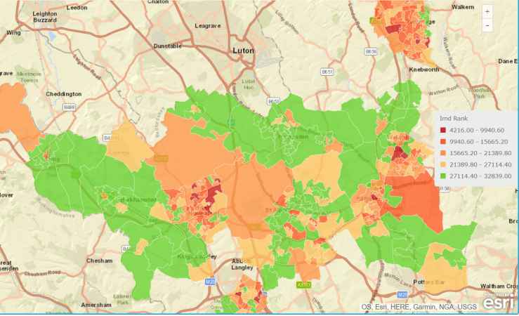
Let’s start with a view of the Index of Multiple Deprivation over the towns in the study:

deprivation hertfordshire
Here, the colour red indicates high deprivation.

No real surprises here, areas of most towns are highly deprived (St Albans less so) and countryside areas show the least deprivation.

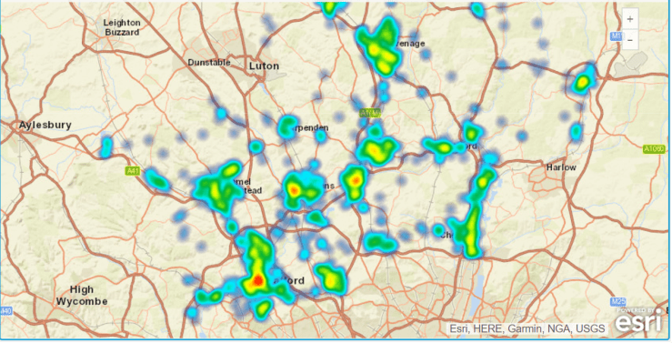
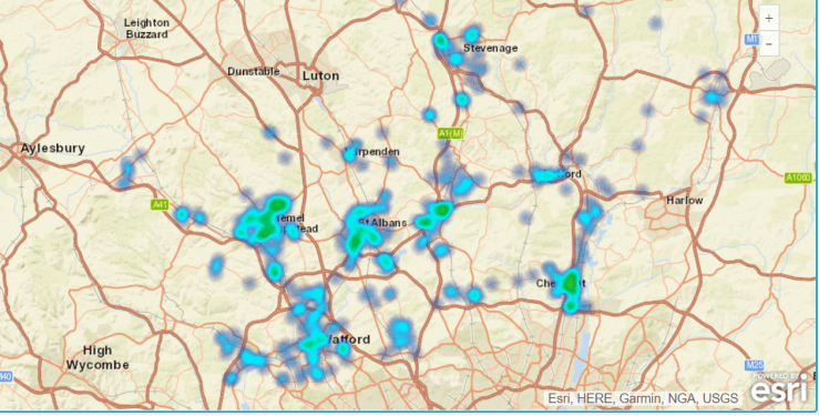
Now we look at the incidence of certain crime types in February 2017:

Herts_antisocial
Antisocial behaviour

In February 2017, Watford, St Albans and Hatfield had a higher concentration of antisocial behaviour.

Herts_vehicle_crime
Vehicle Crime

Hemel Hempstead has a higher incidence of vehicle crime.

herts_violence
Violence and sexual offences

Watford and Hemel are top of the league…

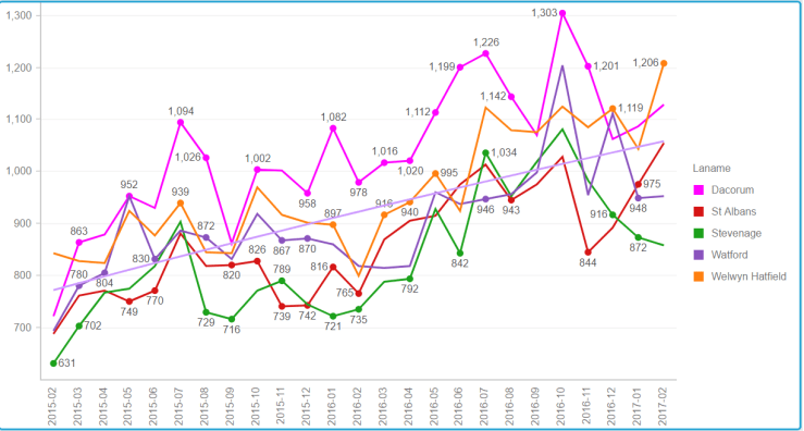
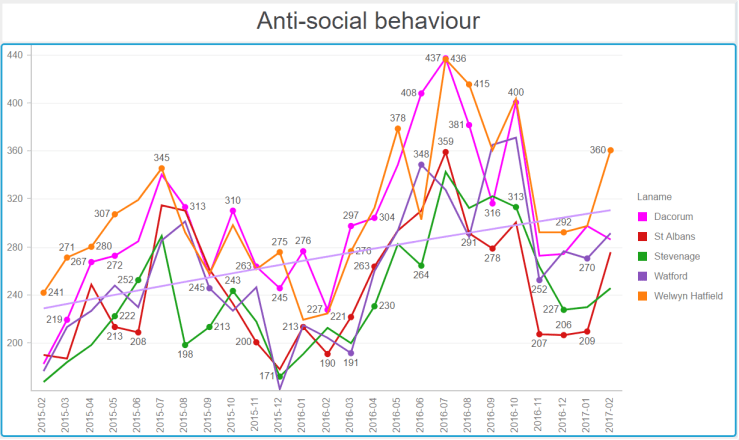
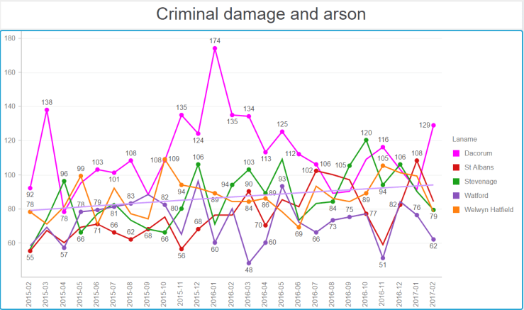
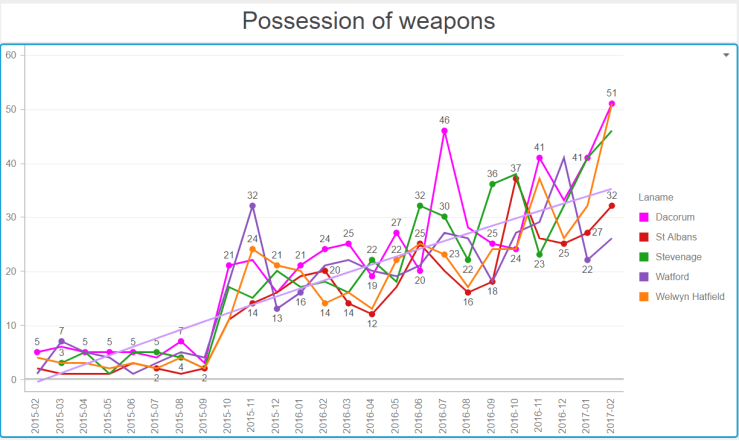
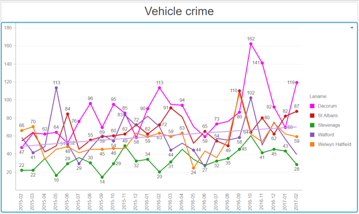
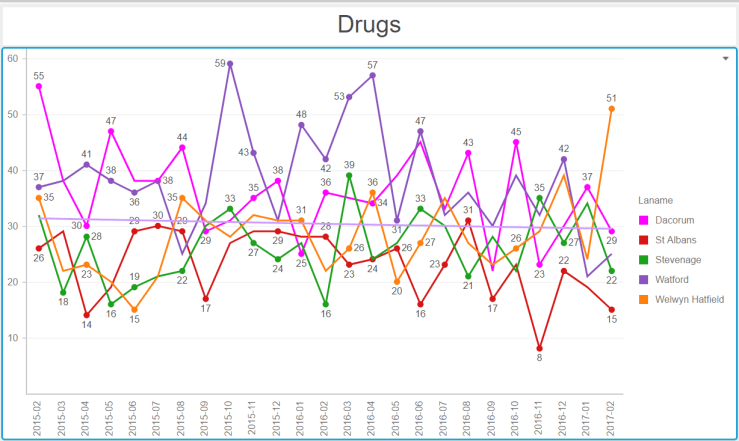
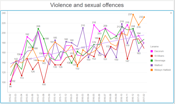
Now the series of graphs below require some explanation. They show, for number of big towns in Hertfordshire, the crime numbers by category over 24 months (February 2015 to February 2017).  To help put our town in perspective, I have represented the line for Hemel in shocking pink. The horizontal line on each graph shows the general trend over time. They all go up…

HertsTownsAllCrime
All categories of crime.

Alarmingly, Hemel seems to be at the high mark for the total number of crimes.

HertsTownsASB
Note the seasonality. Being antisocial requires warmer weather.
HertsTownsCDA
Blimey Hemel ! What happened in winter 2015-2016 ?
HertsTownsWeapons
Are we tooling up for an invasion or something ? Or is the police reporting things differently ?
HertsTownsVehicleCrime
Hemel Hempstead, vehicle crime capital of Hertfordshire
HertsTownsDrugs
A generally low number of drugs offences, with a slow downwards trend.
HertsTownsVSex
A worrying upwards trend for all towns.

And there you have it. In almost all towns, we have increasing crime numbers in all categories being reported by the police. What does this mean ? Does this mean the police are more efficient at detecting and reporting crime ?

Crime affects us all – I wonder what our MPs have to say about this ? Why is it on the increase?

Election 2017: A local study of crime

I happen to be, on Facebook, member of two groups: One about Brighton, where I first arrived in the UK in 1984, and one about Hemel Hempstead, the town where I have lived since 1993. You could not think of two more different places. Brighton is lefty, deprived and interesting, whilst Hemel is quite conservative, relatively affluent and hard-working.

The Facebook pages reflect this. On the Hemel one, people are regularly complaining about bikes and scooters being stolen, along with regularly heated debates between the Conservative, DailyMaily, Flog’em and Hang’em members and the small but resolute core of Left-leaning, liberal people. It’s a great way of looking beyond your ‘bubble’.

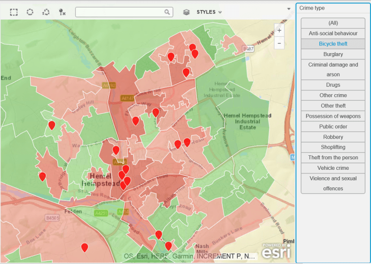
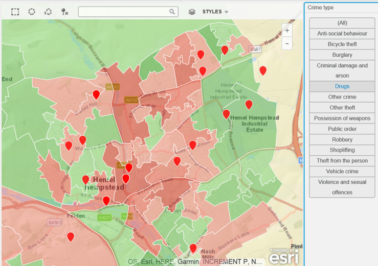
The rather frequent complaints about bike thefts led me to procure some crime data – a great repository of this exists at data.police.uk, so i thought it would be useful to plot this on a map and see if there is a problem with bike theft in my hard-working, nuttily conservative town. As a background canvas, I am using deprivation data to identify areas which are more or less subject to crime, according to the Index of Multiple Deprivation data for 2015, which can be found here.

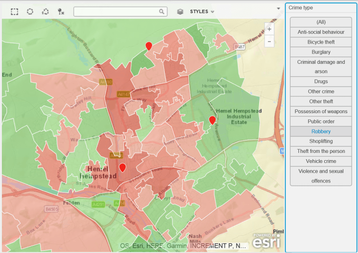
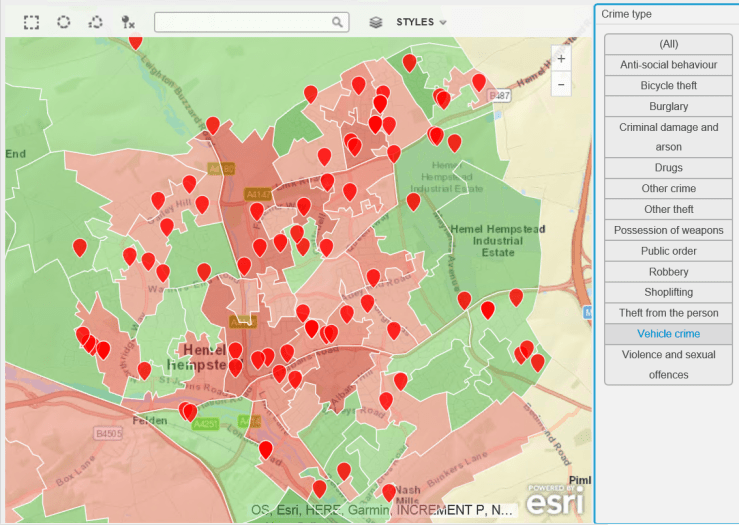
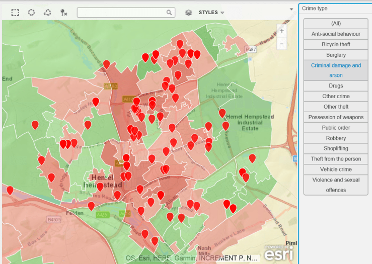
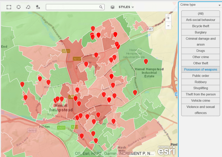
The data is for February 2017. The background deprivation colour scheme goes from green (no big issue with crime) to red (rather more crime).

Do you think bike theft is Hemel Hempstead’s biggest crime issue ? Let’s see…

Bicycle Theft
Bike Thefts. Some, but no epidemic…
Drugs
Hard-working little town – no time for drugs (or very good at not getting caught).
Robbery
Robberies are not an issue, apparently.
Vehicle Crime
Having two more wheels than a bike increases criminality. Vehicle crime is more prevalent.
Criminal Damage and Arson.PNG
Ah. A bit more serious, criminal damage and arson. Not so good.
Weapons
Rather too many weapons for my liking.
Violence and Sexual
This is no laughing matter. What is going on ?

And there you have it – a snapshot of the criminal landscape in the town where I live. As usual with such investigations, many questions arise:

  • How does that look plotted over time ? (I have the data, watch this space).
  • What does my MP think about it ?
  • Why are there clusters of violence in certain residential areas ?
  • How does my town compare to other similar towns ?
  • How does the police cope with this workload ? It’s a lot of crime…

Finally, should this be an election issue for the people of Hemel Hempstead ? According to the Facebook page and the local paper, it’s all about bad parking, bike thefts and foxes in gardens.

More maps and questions to come, I think.

(Commercial Message 🙂 )

I have used, as promised, the excellent map layers feature of MicroStrategy 10.7. The background deprivation layer is based on Local Super Output Area (Census sub-division) shapefile, the crime layer uses the February 2017 data from the Hertfordshire Constabulary). 

Election 2017: Context with maps

Well, as promised, I’ve got a MicroStrategy 10.7 environment, some shapefiles and some data from the Electoral Commission’s website. So because it’s a cold rainy bank holiday weekend in the UK (surprise, surprise), I’ve been putting all of this together to try and understand what this election is all about.

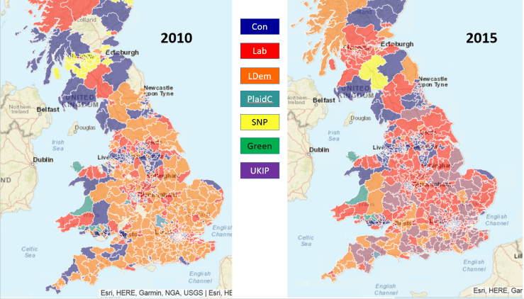
Let’s make a start and compare the 2010 and 2015 general elections. For my dear readers who are not from the UK, the general election is the one that elects our members of parliament. The party that returns the highest number of MPs tends to form the government, with the leader of that party becoming prime minister. It’s quite an important election.

Here we go:

results20102015.PNG

In general, the countryside traditionally votes Conservative whilst the cities trend towards Labour. The Liberal Democrats have a spattering of seats in all areas. At least that was the case until 2015. The election in that year was nothing short of dramatic:

  • Labour lost almost all its seats in Scotland.
  • The Lib Dems were wiped out, losing a colossal share of their vote.
  • The Scottish National Party took control of Scotland.

Looking at London:

London20102015

Again, grim news for the LibDems, losing all seats bar one in London.

Finishing second is not interesting if you’re an MP (Member of Parliament). But I think it reveals, for 2015, the big change in people’s priorities, and in particular the rise of UKIP. The 2015 election took place before the EU independence referendum, It’s interesting that the data I am about to show you was available then – clearly the Remain camp was not paying attention.

Here’s the parties that were in second place in 2010 and 2015:

Second20102015.PNG

Note the very large number of constituencies where UKIP finished second, and the very small number of constituencies where the LibDems reached the same place.

What’s the picture like for London ?

LondonSecond20102015.PNG

Pretty much the same for the poor LibDems – look at the peripheral areas of London where UKIP is moving up the ranks…

The 2017 election should be interesting because UKIP’s purpose has been fulfilled, and beyond policies trending towards the far reaches of the right it’s possible  that the votes that went to UKIP in 2015 may be redistributed. We’ll see…

Commercial Announcement 🙂 ; 

I have prepared these maps, and wrangled the data, using MicroStrategy 10.7. I have used custom shapefiles and joined datasets, with derived metrics to work out the share of the votes and the rankings. I will continue exploring electoral data, in particular looking at key battleground seats to assess the social priorities, referendum result and other interesting dimensions. Here, the layers feature of MicroStrategy 10.7 will prove invaluable.

Find out more about MicroStrategy at:

www.microstrategy.com