Election 2017: Context with maps

Well, as promised, I’ve got a MicroStrategy 10.7 environment, some shapefiles and some data from the Electoral Commission’s website. So because it’s a cold rainy bank holiday weekend in the UK (surprise, surprise), I’ve been putting all of this together to try and understand what this election is all about.

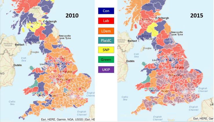
Let’s make a start and compare the 2010 and 2015 general elections. For my dear readers who are not from the UK, the general election is the one that elects our members of parliament. The party that returns the highest number of MPs tends to form the government, with the leader of that party becoming prime minister. It’s quite an important election.

Here we go:

results20102015.PNG

In general, the countryside traditionally votes Conservative whilst the cities trend towards Labour. The Liberal Democrats have a spattering of seats in all areas. At least that was the case until 2015. The election in that year was nothing short of dramatic:

  • Labour lost almost all its seats in Scotland.
  • The Lib Dems were wiped out, losing a colossal share of their vote.
  • The Scottish National Party took control of Scotland.
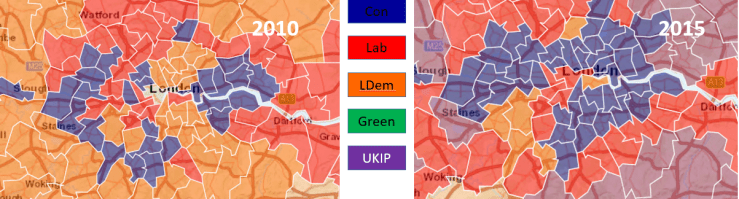
Looking at London:

London20102015

Again, grim news for the LibDems, losing all seats bar one in London.

Finishing second is not interesting if you’re an MP (Member of Parliament). But I think it reveals, for 2015, the big change in people’s priorities, and in particular the rise of UKIP. The 2015 election took place before the EU independence referendum, It’s interesting that the data I am about to show you was available then – clearly the Remain camp was not paying attention.

Here’s the parties that were in second place in 2010 and 2015:

Second20102015.PNG

Note the very large number of constituencies where UKIP finished second, and the very small number of constituencies where the LibDems reached the same place.

What’s the picture like for London ?

LondonSecond20102015.PNG

Pretty much the same for the poor LibDems – look at the peripheral areas of London where UKIP is moving up the ranks…

The 2017 election should be interesting because UKIP’s purpose has been fulfilled, and beyond policies trending towards the far reaches of the right it’s possible  that the votes that went to UKIP in 2015 may be redistributed. We’ll see…

Commercial Announcement 🙂 ; 

I have prepared these maps, and wrangled the data, using MicroStrategy 10.7. I have used custom shapefiles and joined datasets, with derived metrics to work out the share of the votes and the rankings. I will continue exploring electoral data, in particular looking at key battleground seats to assess the social priorities, referendum result and other interesting dimensions. Here, the layers feature of MicroStrategy 10.7 will prove invaluable.

Find out more about MicroStrategy at:

www.microstrategy.com

There’s a General Election in the UK…

And look at this lovely constituency map, rendered in MicroStrategy 10.4 !

UK Constituencies

The question here is: Will I have the time to:

  • Upgrade my installation to 10.7 ?
  • Use the wondrous new layers feature to blend the Referendum results, deprivation data and 2015 election results ?
  • Maybe toggle with  the 2010 election results, to work out which constituencies might swing one way or another ?
  • Pretend I’m a campaign manager, targeting constituencies with relevant messages ?

Such fun !

I am not promising anything, busy busy… but playing with maps and data will make the whole election thing interesting, regardless of the outcome.

Winter Mortality in 2015 – Answer from the Secretary of State

Beyond the update to a couple of posts I made in the last few weeks, I wanted to point out two important aspects, or side-effects, of this exercise:

First, you may complain about the state of things in the UK, but one thing that marks this country apart from others is this: I wrote to my MP to point out an anomaly in the data and to ask questions about it. My MP passed my letter on to the secretary of state, Jeremy Hunt, from whom today I received a reply via my MP. Now, I am not particularly important, I do not play golf with my MP and certainly do not endorse his party’s policies. Nevertheless, the machinery of state processed my request and provided me with an answer. Remarkable.

Second, and this may be a plug for my esteemed employers, I am using the software from my company to indulge my love of maps and data. In doing this, I am turning into what you might call a ‘Citizen Data Journalist’. With this, I have analysed the Brexit vote in depth on a region by region basis, and I have verified the data story about excess mortality in 2015.

The first point is important as it indicates a state that functions properly. The second point might well become another facet of the information singularity that we are travelling through. In these days of ‘alternative facts’ and ‘post truth’, it is possible for you to get hold of the data and verify assertions made, either by the media or the government. All you need is a computer and some free software – I recommend, of course, MicroStrategy Desktop (other providers exist).

Anyway, remember this?

deaths2014vs2015

This chart shows the excess deaths in winter 2015. Someone published this data and blamed government cuts for this spike. Our government was indignant and refuted this claim.

I covered this in my previous posts:

About the excessive number of deaths in 2015 in the UK

and

An update on the excess mortality in the UK in 2015

Actually, the answer to this resides at the Office of National Statistics. But the Secretary of State was kind enough to explain exactly what happened:

In particular, Public Health England (PHE) report that the predominant strain of influenza in 2014/2015 was A(H3N2) which was particularly virulent in older people, an already at-risk group, while in 2015/2016 the predominant virus of influenza was A(H1N1)pdm09, which particularly affected younger people in terms of hospitalisations and intensive care unit admissions. The ONS statistics are available at http://www.ons.gov.uk by searching for ‘Excess winter mortality in England and Wales’.

The letter then goes on to explain the steps taken in latter years to prevent the reoccurrence of the winter spike.

I think there is a remaining question: There have been annual vaccination campaigns against influenza. One can assume that in 2014/2015, this was not effective. Further study of the ONS reports could give you the answer.

This concludes my investigation on this topic. Thank you for reading !

An update on the excess mortality in the UK in 2015

You’ll remember my previous article looking at the mortality data for 2015, and the intriguing (and concerning) spike in deaths in the early weeks of that year. I concluded the article by stating that it would be interesting to find out why that happened.

I am always keen to address a problem with more than one approach. I did two things:

  1. I wrote to my MP to ask why this had happened. My MP duly replied by stating that he had passed my query to the Department of Health. I await further news.
  2. I searched for this on Google.

My search led me to the Office of National Statistics, which publishes data on mortality every year. In the report for 2015, this spike in mortality was identified, and a thorough analysis undertaken.

You can find this report here.

My understanding of this report is that there was a flu epidemic for which the annual flu vaccine was not effective. This affected the 75+ age group, which resulted in the higher mortality. This information has been available for a while, and – annoying as it is – seems to vindicate our government’s indignation.

Let’s see what the Department of Health comes up with…


About the excessive number of deaths in 2015 in the UK

A number of newspapers have recently carried a story about a marked increase in the number of deaths in the UK, in particular during the year 2015. This is even being discussed in newspapers in other countries… The story was rebutted quite violently by the government, with various claims of shoddy statistics and politically biased inferences.

Having a passing interest in social and demographic statistics, I was curious to see if the data supported the theory – I’ve often said that a single number is meaningless unless you look at it over time, and in comparison with other measurements. More about this later on in the article…

Using official data from data.gov.uk, I played around with the data to try and add some context behind it.

First, a summary:

deathssummary

There is, indeed, a marked increase in the number of deaths in 2015, particularly in the 75+ age groups. However, and this is where some journalists have been lazy, the deaths in that age group decrease in 2016 compared to 2015, although there is an overall increase across all age groups from 2013 to 2016.

One question to ask is what do the number of deaths mean as a proportion of the total cohort for each age group ? We know the population is increasing, and each year a possible change in the number of people reaching the relevant age groups… I’ll leave that analysis till later.

The data I procured shows the deaths per week, per year, per age group. As the number for the 75+ group was the most significant, I looked at it in more detail:

deaths2014vs2015

What jumps out immediately is the huge spike in deaths in the first 17 weeks of 2015. Looking at data from other years, the mortality rates seem to track closely year on year, but 2015 seems to have been exceptional. If we look at 2015 vs 2016:

deaths2015vs2016

We see that 2016 does not show this spike, and tracks more closely to 2014.

So the real question is: What happened to our elderly population in the early weeks of 2015? Was it cold weather or a flu epidemic ? Maybe you can have a go at finding out…

My conclusion is that there may or may not be a correlation between the cuts in the NHS, the social care budget and the increasing number of deaths over a number of years. I don’t think my analysis here can answer that question… but I think it reveals a far more intriguing story – what was killing more old people in the early weeks of 2015 ?

An amusing coincidence…or is it ?

Following on from my post on handling difficult data, I was perusing my Facebook feed and I was very surprised to see this map:

heavy-metal

This represents the number of heavy metal bands per 100,000 people. Now, compare this to the reading achievement map in my previous post, showing countries with the biggest reading gap between boys and girls:

readingdiff_flip

The maps look very similar… now, this is a semi-serious post, and you should not attempt to read anything significant into this. You’d need to delve deeper in the data. But let’s ask the question anyway: Is there a correlation between the density of heavy metal bands and the reading ability of girls ? Does Ingrid turn to Jane Austen because Sven wants to be like Metallica ? Or, more significantly, does a liking for heavy metal indicate a better education system ? The countries with the darker colour, irrespective of gender, have a higher education achievement.

Difficult Differences in Data

All too often BI developers are so wrapped up in the tech and the process of building their clever, pretty solutions that they fail to see the significance of the data they are handling.

I have been guilty of this on many occasions – a clever chart about type 2 diabetes that shows a pretty grim reality, or a heat map that highlights a probably underpaid or desperate person with their fingers in the till… In all cases, there are people behind the grids and graphs that we handle on a daily basis.

The difficulty with data is that it can either be spun to tell a story, or conversely reveal a truth too awful to bear. A case in point is when data is used to work on areas of discrimination such as race, gender or class. How do you interpret your findings, and how do you handle difference ?

To illustrate this, I am going to pick a contentious area – Gender – and focus on a sub-area of it, education. I do this because in this case the data seems to reveal something pretty wonderful.

The data documents the findings of the Pisa survey, a programme undertaken by the OECD to measure the achievement of 15 year-old children in participating countries.

Pisa Science page at the OECD

Pisa Maths page at the OECD

Pisa Reading page at the OECD

It’s interesting to note that the survey itself splits the data by achievement for boys and girls. Thus, in the very design of the survey, a difference is acknowledged between the genders and is used for comparison. I am not keen to get sucked into gender politics, as I really do not have any in-depth knowledge of the issue. But as a data explorer, I am quite interested by a few facts revealed by the survey:

  • Finland does a pretty good job.
  • Girls tend to be more or less achieving as well as boys in Science, but boys appear to pull ahead a bit in Maths.

The most astonishing finding, however, is the vast gulf in reading achievement between boys and girls, with girls way ahead in all countries – and thus all cultures. The survey does state that the gap is closing, with an improvement for boys and a degradation for girls (that last point is concerning).

Pisa Results 2015 volume 1

How do you explain that ? Why is it that girls are so much better at reading than boys ? More importantly, when comparing both, how do you present your findings to avoid falling into a gender bias trap, especially when it comes to difference ?

An attempt to explain this is made below with a world map showing the reading differential between girls and boys, with the measure shown as a positive figure (Girl ability – boy ability):

readingdiff

So there we have it. All over the world, girls are reading better than boys. In some places like Finland or Korea, already very high in achievement in all matters, the gap is even more pronounced. Can you deduce that increased education capability results in an even higher reading ability differential ? The data seems to support that.

That’s a good story. But, with the same data, we can tell a different story. Assume that we live in unenlightened times, where we decide that the lagging of reading ability in boys is to be spun as a crisis:

readingdiff_flip

All we’ve done here is that we have flipped the formula (Boy ability – girl ability) and applied a more alarming threshold. Thus, a tabloid journalist can alarm us all by stating that Scandinavian countries are in the grip of a reading crisis of untold proportions.

What was, in the previous illustration, a positive story has now become an alarming picture of male underachievement – whereas the real story, in my opinion, is that girls genuinely do seem to be better at reading than boys.

Why not try this yourself ? The OECD kindly shares its data, so you can download it and play with it in your tool of choice. I use MicroStrategy (I work for them)  for all my data discoveries – you can download the Desktop version for free here:

Microstrategy Desktop