There’s a General Election in the UK…

And look at this lovely constituency map, rendered in MicroStrategy 10.4 !

UK Constituencies

The question here is: Will I have the time to:

  • Upgrade my installation to 10.7 ?
  • Use the wondrous new layers feature to blend the Referendum results, deprivation data and 2015 election results ?
  • Maybe toggle with  the 2010 election results, to work out which constituencies might swing one way or another ?
  • Pretend I’m a campaign manager, targeting constituencies with relevant messages ?

Such fun !

I am not promising anything, busy busy… but playing with maps and data will make the whole election thing interesting, regardless of the outcome.

MicroStrategy World 2017 – Impressions

This week I had the privilege to travel to Washington DC for Microstrategy’s World 2017 conference to present two sessions and talk to customers on pointy technical topics.

MicroStrategy fielded a vast programme, most of which will be available on line shortly. I will not, in this post, be going into any detail about the content of the conference. Rather I will describe, aided by my own pictures, my impressions of the trip, the people I met and some of the conversations I had.

But the journey has to start somewhere:

Heathrow
Heathrow, Terminal 2 – 7 Am, Tuesday 18th April

Slightly wary of United Airlines, I board United 123 for Washington Dulles. The flight leaves on time, and proves to be relaxed and uneventful.

World2017
On my way

National Harbor

Niceday
A nice day

They might know a thing or two about our software.

GreatEngineers
The Great Engineers

The conference gets under way

ItBegins
Anticipation buildup

Colleagues

RemcoDiego
European encounter

Safe harbor

SafeHarbor
We’re going to see new things !

Party Time !

Party
Incredible

Between Sessions

BetweenSessions
Inspiring view

Arcology

Gaylord
Awe Inspiring

Presenting in the ballroom

Ballroom
Presenting is a performance art

And then home.

Sunset in Dulles
Sunset with thunderstorm at Dulles Airport

Winter Mortality in 2015 – Answer from the Secretary of State

Beyond the update to a couple of posts I made in the last few weeks, I wanted to point out two important aspects, or side-effects, of this exercise:

First, you may complain about the state of things in the UK, but one thing that marks this country apart from others is this: I wrote to my MP to point out an anomaly in the data and to ask questions about it. My MP passed my letter on to the secretary of state, Jeremy Hunt, from whom today I received a reply via my MP. Now, I am not particularly important, I do not play golf with my MP and certainly do not endorse his party’s policies. Nevertheless, the machinery of state processed my request and provided me with an answer. Remarkable.

Second, and this may be a plug for my esteemed employers, I am using the software from my company to indulge my love of maps and data. In doing this, I am turning into what you might call a ‘Citizen Data Journalist’. With this, I have analysed the Brexit vote in depth on a region by region basis, and I have verified the data story about excess mortality in 2015.

The first point is important as it indicates a state that functions properly. The second point might well become another facet of the information singularity that we are travelling through. In these days of ‘alternative facts’ and ‘post truth’, it is possible for you to get hold of the data and verify assertions made, either by the media or the government. All you need is a computer and some free software – I recommend, of course, MicroStrategy Desktop (other providers exist).

Anyway, remember this?

deaths2014vs2015

This chart shows the excess deaths in winter 2015. Someone published this data and blamed government cuts for this spike. Our government was indignant and refuted this claim.

I covered this in my previous posts:

About the excessive number of deaths in 2015 in the UK

and

An update on the excess mortality in the UK in 2015

Actually, the answer to this resides at the Office of National Statistics. But the Secretary of State was kind enough to explain exactly what happened:

In particular, Public Health England (PHE) report that the predominant strain of influenza in 2014/2015 was A(H3N2) which was particularly virulent in older people, an already at-risk group, while in 2015/2016 the predominant virus of influenza was A(H1N1)pdm09, which particularly affected younger people in terms of hospitalisations and intensive care unit admissions. The ONS statistics are available at http://www.ons.gov.uk by searching for ‘Excess winter mortality in England and Wales’.

The letter then goes on to explain the steps taken in latter years to prevent the reoccurrence of the winter spike.

I think there is a remaining question: There have been annual vaccination campaigns against influenza. One can assume that in 2014/2015, this was not effective. Further study of the ONS reports could give you the answer.

This concludes my investigation on this topic. Thank you for reading !

Of Consulting and Corridors

Belgo
Belgo corridor in Montreal, courtesy of Kalina B.

This is not at all about consulting, beyond the fact the key subject here – corridors – came up as a conversation topic during one of our all to rare gatherings of our consulting team colleagues.

As consultants, we tend to see a lot of corridors in our travels. I am sharing some pictures here, from my colleagues and myself, that we exchanged following that conversation.

Not all corridors are encountered in the course of our work. But the perspective offered by these are sometimes remarkable.

Enjoy !

shuttle
The Shuttle, Channel Tunnel
Golden.jpg
Golden Jubilee Hospital, Glasgow
MK.jpg
Offices, Milton Keynes
Corbie Hotel in Geel, Belgium.png
Hotel in Belgium, courtesy of John D.
tunnel
Wedding Picture, courtesy of Kamil Z.
Lynebank Hospital
Lynebank Hospital, Dunfermline, Scotland. Great for wheelchair racing 🙂

More pictures to come… but on the subject of corridors, and if you’re a science fiction fan, you might want to read Eon followed by Eternity from Greg Bear. There’s a very interesting example of a corridor. Trust me.

An update on the excess mortality in the UK in 2015

You’ll remember my previous article looking at the mortality data for 2015, and the intriguing (and concerning) spike in deaths in the early weeks of that year. I concluded the article by stating that it would be interesting to find out why that happened.

I am always keen to address a problem with more than one approach. I did two things:

  1. I wrote to my MP to ask why this had happened. My MP duly replied by stating that he had passed my query to the Department of Health. I await further news.
  2. I searched for this on Google.

My search led me to the Office of National Statistics, which publishes data on mortality every year. In the report for 2015, this spike in mortality was identified, and a thorough analysis undertaken.

You can find this report here.

My understanding of this report is that there was a flu epidemic for which the annual flu vaccine was not effective. This affected the 75+ age group, which resulted in the higher mortality. This information has been available for a while, and – annoying as it is – seems to vindicate our government’s indignation.

Let’s see what the Department of Health comes up with…


About the excessive number of deaths in 2015 in the UK

A number of newspapers have recently carried a story about a marked increase in the number of deaths in the UK, in particular during the year 2015. This is even being discussed in newspapers in other countries… The story was rebutted quite violently by the government, with various claims of shoddy statistics and politically biased inferences.

Having a passing interest in social and demographic statistics, I was curious to see if the data supported the theory – I’ve often said that a single number is meaningless unless you look at it over time, and in comparison with other measurements. More about this later on in the article…

Using official data from data.gov.uk, I played around with the data to try and add some context behind it.

First, a summary:

deathssummary

There is, indeed, a marked increase in the number of deaths in 2015, particularly in the 75+ age groups. However, and this is where some journalists have been lazy, the deaths in that age group decrease in 2016 compared to 2015, although there is an overall increase across all age groups from 2013 to 2016.

One question to ask is what do the number of deaths mean as a proportion of the total cohort for each age group ? We know the population is increasing, and each year a possible change in the number of people reaching the relevant age groups… I’ll leave that analysis till later.

The data I procured shows the deaths per week, per year, per age group. As the number for the 75+ group was the most significant, I looked at it in more detail:

deaths2014vs2015

What jumps out immediately is the huge spike in deaths in the first 17 weeks of 2015. Looking at data from other years, the mortality rates seem to track closely year on year, but 2015 seems to have been exceptional. If we look at 2015 vs 2016:

deaths2015vs2016

We see that 2016 does not show this spike, and tracks more closely to 2014.

So the real question is: What happened to our elderly population in the early weeks of 2015? Was it cold weather or a flu epidemic ? Maybe you can have a go at finding out…

My conclusion is that there may or may not be a correlation between the cuts in the NHS, the social care budget and the increasing number of deaths over a number of years. I don’t think my analysis here can answer that question… but I think it reveals a far more intriguing story – what was killing more old people in the early weeks of 2015 ?

An amusing coincidence…or is it ?

Following on from my post on handling difficult data, I was perusing my Facebook feed and I was very surprised to see this map:

heavy-metal

This represents the number of heavy metal bands per 100,000 people. Now, compare this to the reading achievement map in my previous post, showing countries with the biggest reading gap between boys and girls:

readingdiff_flip

The maps look very similar… now, this is a semi-serious post, and you should not attempt to read anything significant into this. You’d need to delve deeper in the data. But let’s ask the question anyway: Is there a correlation between the density of heavy metal bands and the reading ability of girls ? Does Ingrid turn to Jane Austen because Sven wants to be like Metallica ? Or, more significantly, does a liking for heavy metal indicate a better education system ? The countries with the darker colour, irrespective of gender, have a higher education achievement.

Difficult Differences in Data

All too often BI developers are so wrapped up in the tech and the process of building their clever, pretty solutions that they fail to see the significance of the data they are handling.

I have been guilty of this on many occasions – a clever chart about type 2 diabetes that shows a pretty grim reality, or a heat map that highlights a probably underpaid or desperate person with their fingers in the till… In all cases, there are people behind the grids and graphs that we handle on a daily basis.

The difficulty with data is that it can either be spun to tell a story, or conversely reveal a truth too awful to bear. A case in point is when data is used to work on areas of discrimination such as race, gender or class. How do you interpret your findings, and how do you handle difference ?

To illustrate this, I am going to pick a contentious area – Gender – and focus on a sub-area of it, education. I do this because in this case the data seems to reveal something pretty wonderful.

The data documents the findings of the Pisa survey, a programme undertaken by the OECD to measure the achievement of 15 year-old children in participating countries.

Pisa Science page at the OECD

Pisa Maths page at the OECD

Pisa Reading page at the OECD

It’s interesting to note that the survey itself splits the data by achievement for boys and girls. Thus, in the very design of the survey, a difference is acknowledged between the genders and is used for comparison. I am not keen to get sucked into gender politics, as I really do not have any in-depth knowledge of the issue. But as a data explorer, I am quite interested by a few facts revealed by the survey:

  • Finland does a pretty good job.
  • Girls tend to be more or less achieving as well as boys in Science, but boys appear to pull ahead a bit in Maths.

The most astonishing finding, however, is the vast gulf in reading achievement between boys and girls, with girls way ahead in all countries – and thus all cultures. The survey does state that the gap is closing, with an improvement for boys and a degradation for girls (that last point is concerning).

Pisa Results 2015 volume 1

How do you explain that ? Why is it that girls are so much better at reading than boys ? More importantly, when comparing both, how do you present your findings to avoid falling into a gender bias trap, especially when it comes to difference ?

An attempt to explain this is made below with a world map showing the reading differential between girls and boys, with the measure shown as a positive figure (Girl ability – boy ability):

readingdiff

So there we have it. All over the world, girls are reading better than boys. In some places like Finland or Korea, already very high in achievement in all matters, the gap is even more pronounced. Can you deduce that increased education capability results in an even higher reading ability differential ? The data seems to support that.

That’s a good story. But, with the same data, we can tell a different story. Assume that we live in unenlightened times, where we decide that the lagging of reading ability in boys is to be spun as a crisis:

readingdiff_flip

All we’ve done here is that we have flipped the formula (Boy ability – girl ability) and applied a more alarming threshold. Thus, a tabloid journalist can alarm us all by stating that Scandinavian countries are in the grip of a reading crisis of untold proportions.

What was, in the previous illustration, a positive story has now become an alarming picture of male underachievement – whereas the real story, in my opinion, is that girls genuinely do seem to be better at reading than boys.

Why not try this yourself ? The OECD kindly shares its data, so you can download it and play with it in your tool of choice. I use MicroStrategy (I work for them)  for all my data discoveries – you can download the Desktop version for free here:

Microstrategy Desktop


From Exploration to Exploitation – 1: Investigating lifecycles for sustainable velocity

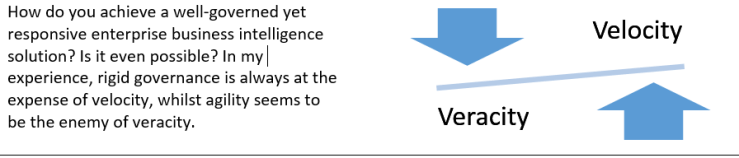
Information wants to be free – but an enterprise needs it to be like a life-giving stream of sustaining insight, rather than a thin trickle of stale data or worse, a tsunami of garbage. Maintaining a robust, innovative and flexible ecosystem in an ever-increasing whirlpool of data represents a daunting challenge. Just as software development practices have moved away from waterfall methodologies to agile practices, an enterprise business intelligence system has to introduce velocity whilst preserving veracity. It’s clear to see that the traditional DEV/TEST/PROD lifecycle is no longer the whole solution, but what does the alternative look like? This article describes the evolution of business intelligence lifecycles and prepares the ground for a further study of implemented practices.

Having your cake and eating it

System of record outputs must be truthful and resilient if they are used for regulatory purposes, or if they are part of mission-critical business processes. Yet, timely and volatile insights are also key to fine-tune the steering of a business process – think about a mobile phone company needing to know the take up of a new tariff or device, or modelling the impact of new financial regulations about risk on a banking portfolio. This information is needed now, not three to six month down the line after a laborious waterfall process involving many separate, thus siloed, teams.

v-vs-v

That problem is solved with modern tools allowing governed data discovery and process differentiation between system-of-record outputs and ad-hoc or exploratory products. If your current system is not capable of doing this, you need to ask yourself why…

Yet, as always, the world does not stand still. You congratulate yourself with the achievement of a governed data discovery solution, and here comes the data lake!

This throws up a completely new challenge because you want to avoid a proliferation of exploration and exploitation tools, and you also want to keep a grip on the potential explosion of new applications. From my perspective, I’ve heard about Data Lakes and Big Data for quite a few years now – but now, we’re encountering these in increasing frequency. So how do we handle these?

What’s the data lake for?

I’m hoping that the data lake is a familiar concept for all – there’s been enough stuff written about the subject. The best question to ask is: what is it used for? I’ve seen two broad use cases so far: Genuine exploration of colossal amounts of unstructured data, and replacement for Data Warehousing appliances.

The first case is about shoving pretty much any data in the lake, and using tools and processes to make sense of it. The second case proposes that storing colossal data warehouses is more cost effective on Hadoop technologies than more traditional large-scale solutions. You’d be correct in thinking that a data lake can address both use cases, but you’ll need to solve the veracity and velocity gradients inherent in both cases: Exploration is done by few, using unpredictable and intensive processes, yielding insights and results which may be volatile. Exploitation, the second case, is used by many and requires resilience and veracity enforced by governance.

Where is it going?

I don’t have the answer – yet. The installations I have seen are still in their infancy, and exploration is not simply limited to the data, but also to the processes and governance that have to be developed if a smooth and repeatable transition from exploration to exploitation is to be achieved. What I will try to do in this article is to map the evolution from highly governed implementations to those I see emerging today, with governed discovery and data blending between systems of record and exploratory data lakes.

Business Intelligence system evolution

In the beginning: The traditional setup

lf1.png

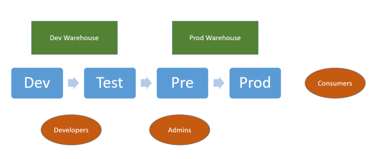
This environment provides consumers with highly governed outputs. Change control and governance are strongly enforced – new developments go through extensive testing prior to reaching the end users. Thus, robustness and resilience are the strong points of such environments, whilst the weak points are agility and velocity. New data or functionality take so long to evolve that end-users declare independence and branch off on tools outside the corporate-mandated toolset. Not surprisingly, such systems are getting increasingly rare these days.

Reluctantly, some freedom for privileged end users

lf2.png

Here analysts are given freedom to develop their own offerings but these are all based on central data. This allows for different versions of reports and dashboards, but does not address the need to rapidly model new data and exploit it. Resilience and robustness are preserved. Agility is introduced, with a small risk of divergence from the single version of the truth. Users will still work outside the system on new, volatile data. Governance becomes more complex as many new reports, and versions of those, proliferate within end-user folders.

Today: Freedom expands at a fast pace with new data and new challenges

lf3.png

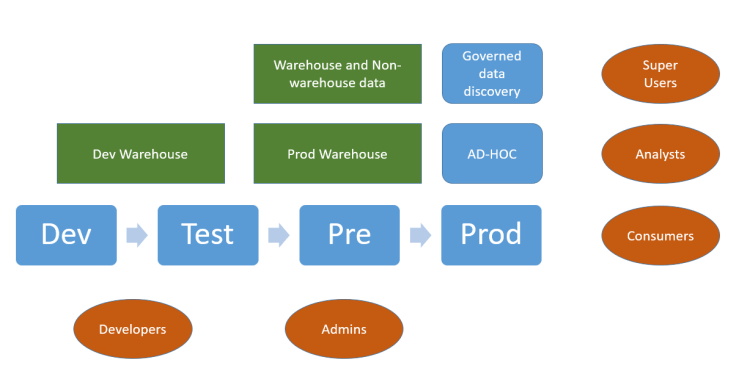
Today we can add external data to the mix, and a new type of user (the Super-user) is empowered to import new data and blend this with system of record data. This brings into the enterprise solution the previously delinquent users who employed other tools to get results. This also increases velocity, but introduces a veracity gradient if the offerings from the super-users, based on blended data, start diverging from the governed and curated corporate data. Kite-marking ensures that outputs from the system-of-record process are recognised and differentiated from the ad-hoc, agile offerings.

Your strategic toolset should provide you with the necessary functions to identify ad-hoc, agile offerings that start to scale and become part of key business processes. These offerings are then prime candidates for being fed back into the system-of-record process loop, as they can be industrialised and made resilient for the larger consumer community. This also ensures that a solution does not become dependent on one individual – the creator – but can instead be supported and maintained by the developers and the admin teams that look after the system-of-record process stack.

Another feature of this environment is that the load on the production servers becomes less predictable. As development and application architecture become less centralised, your enterprise tool must have the capability to govern and scale up in a safe manner. Whilst the development bottleneck is reduced, the administrators will have new tasks in identifying and restricting the resources that these new users can employ. This restriction may be an issue, and still cause point solutions to be developed outside of the enterprise solution.

Such systems, rendered possible by advances in the best enterprise business intelligence tools, are becoming increasingly common.

And then: Big data happens

lf4

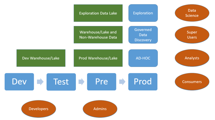
As stated in the introduction to this article, in some cases the data lake is used as a traditional data source and thus becomes tied to the core system-of-record process. It’s when it’s used for exploration that yet another cohort of users, the data scientists, can use the enterprise tool to launch exploratory queries to gather new insights. What’s happening now is that we have, in addition to the traditional dev/test/prod lifecycle axis (the exploitation axis) another axis for exploration, as shown in the diagram below:

lf5.png

Our consumers are now at the confluence of two types of output: System-of-record offerings, strong on veracity and engineered to scale, and exploration offerings, high in velocity but not necessarily scalable or resilient. This poses a challenge: Our consumers range from shop/branch/store users all the way to executives. Our offerings need to come with a quality rating so that the end user understands how the insight was produced, and that there is a difference between high-velocity, high-volatility outputs that will not have gone through the engineering and resilience rigours that the system-of-record items will provide.

Volatility is the key concept here. It relates to the persistence of an offering. If it is transient, needed for a short period of time only, it should be treated as such and not much effort should be put into making it scalable and/or resilient. Conversely, if an exploration-originated offering starts to be used by many people, and becomes an essential part of key business processes, then it must be integrated in the system-of-record domain by shifting it from the exploration axis to the exploitation axis.

lf6

Your enterprise solution should provide you with the necessary tools to identify offerings that are used frequently and the relevant consumer cohorts. You should then set thresholds by which a decision is made to take the exploration offering and send it through the exploitation process to make the offering scalable and resilient. These actions are represented in the diagram above as the ‘persistence assessment process’.

What’s next?

Observation and learning

The last diagram shows where some of our customer’s systems are at today. This represents a rapid departure from lifecycle orthodoxy, and requires new processes for governing and administering the system. The administrators will need to monitor the load on the production systems and provide the information necessary to identify offerings to be industrialised. Development will be devolved, in that the data scientists and super users will be creating the first drafts of new applications based on production data. The task for traditional developers should be simplified and these should become more productive as the requirements are better understood.

New system topologies

The sacrosanct production environment will still exist, but it may be cloned to support the exploration process. This mitigates the risk that intensive exploration and implementation poses to the production environment’s stability. This may increase the administrative workload so you will need to make good use of all the helper tools offered by your enterprise solution.

Free flow of ideas

As an interesting historical analogy, it is now certain that the reason that the Industrial Revolution took place in the United Kingdom rather than France, for instance, is due not to the lack of scientific and technical competence – France had, in the 18th century, a huge cohort of world-changing scientists and innovators – but to the free flow of ideas and a loosening of central governance, supported by an enlightened leadership. France centralised everything and took for ever to release new knowledge, whereas British entrepreneurs simply got on with it.

It may be a bit of a stretch to compare an enterprise business intelligence system to a country – but you do notice the harm done by sclerotic processes to innovation and the sharing of information.

Keep the lid on

Conversely, you can also judge the effect of a proliferation of false information, as events in the US election or the EU Referendum in 2016 have shown. This leads to uncertainty and mistrust, which not desirable in an enterprise setting.

This highlights the importance of a good governance framework, and of educating the consumer to rate the veracity of system outputs based on their source.

And finally…

This is very tantalising, but you might well ask how this Business Intelligence utopia can be achieved. Right now, some of our customers are setting off on this journey – so over time I hope to be able to revisit the topics shown in this article, and maybe share some good practices and highlight some bad ones.

Until then, try not to drown in your data lake!