The Prussian Quadrant:Amusing and Interesting

Clausewitz
Carl Philipp Gottfried von Clausewitz was a Prussian general and military theorist who stressed the “moral” (meaning, in modern terms,psychological) and political aspects of war. 

This article discusses the Prussian, or Clausewitz, Quadrant which was meant to be an army personnel classification method, putting people into four categories based on their levels of intelligence and industriousness.

The two fearsome-looking gentlemen (hover over the pictures to see their names) above are also credited with the invention of the quadrant. See the end of this article for links to Wikipedia articles. I do prefer the picture of Clausewitz, he looks very flamboyant.

Officer
The (possibly) original quadrant

I have read about this quadrant in many books and articles, but I have not been bothered to verify its provenance. I still can’t be bothered, by the way, but feel free to confirm or deny its provenance if you must.

Over my career, I’ve had the chance to test the effectiveness of this classification method and have sometimes evaluated my own performance and decision-making based on those criteria.

The thing about quadrants is that they are easy to understand. Being easy, they tend to be a blunt instrument and lacking in depth. Making important decisions on what you see in a quadrant comes with a healthy dose of risk.

Please note that in this article, I am putting my own spin on the quadrant, based on my experience of people encountered throughout my working life.

I’ll explain the categories over the next few paragraphs, but let’s start by looking at the Quadrant:

Q0
Gartner would be proud of this quadrant.

You can see that there are two axes – the horizontal one evaluates industriousness going from lazy to industrious, whilst the vertical one illustrates intelligence ranging from stupid to clever. Because we like simple models, we only plot four areas in the quadrant (hence the name), and we evaluate people based on the quadrant to which they belong.

I’ll mention a key weakness of the quadrant approach in the conclusion to this article.

Now, let’s examine the first category:

q1
Automation targets, I’m afraid

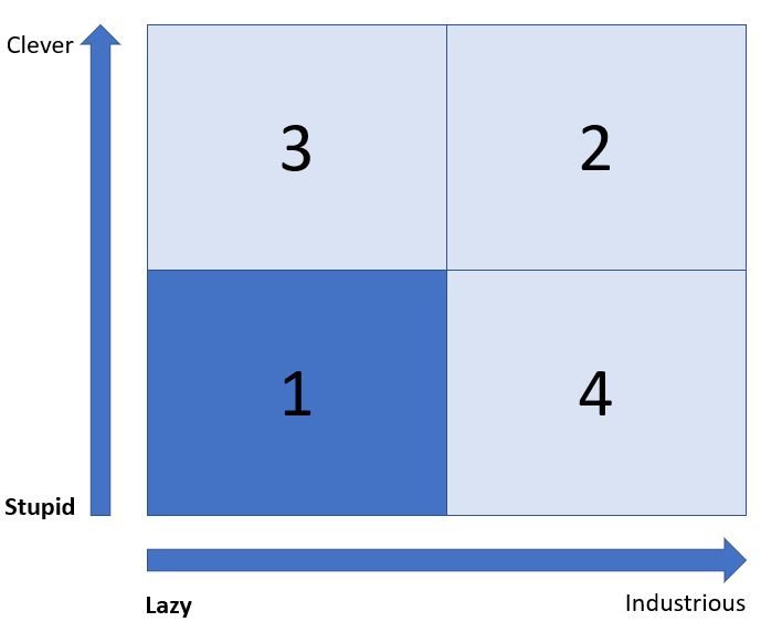
The Stupid and Lazy category can be used for people who are not necessarily stupid per se, but are absolutely not engaged and will not invest any of their resources in the organisation in which they participate.

The Prussians found a use for these persons where they would be given repetitive, simple tasks that needed to be done but would frustrate a more capable or invested individual.

Modern organisations may still need such people but automation and AI are definitely in the frame to replace them.

Next, we have:

Q2
Clever little worker bees

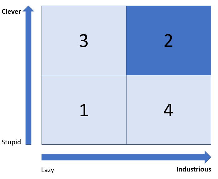
Being Clever and Industrious is an absolute gift to an organisation. Complex tasks can be given to these people, and they will thrive on the challenge.

Furthermore, they are keen to take on more work but run the risk of burning out.

The astute leader will know how hard to drive and challenge these valuable resources to obtain the best sustainable yield.

Clever and Industrious people can often over-complicate things and will design processes and systems that may challenge those who do not have their capacity for thought and work. They may demand of others a yield that, to them, seems achievable, but would have  less endowed individuals working at full throttle permanently. That doesn’t usually end well.

My favourite category is next:

Q3
Work smart, not hard. I love this saying.

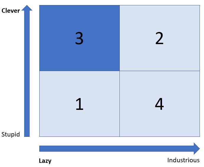
Belonging to the Clever and Lazy category is an attribute that should be valued providing an organisation is not entirely composed of such persons.

People who seek to get the best yield out of the lowest amount of work possible will look for efficiency and simplicity in order to get the tasks done. They are often good delegators.

Clever and Lazy people think laterally and can reach innovative solutions which would elude their more industrious, focused peers.

They need to be led and motivated to keep the lazy side of their nature under control. Promotion is often a method used to get the best out of this category. Being lazy does not imply a lack of ambition and a desire to succeed.

I have left the most dangerous category for last:

Q4
May the Lord preserve us from industrious fools !

One suggestion I have read (not mine, although…) for such people is that they should be shot on sight.

This may be a bit harsh, but there’s no understating the damage that can be caused by someone who is capable of stupidity at scale.

On a less dramatic level, such people could be the ones who follow dogma to the letter and are unable to adapt to unusual or changing situations. They are often a cause of friction and stress when the need arises to be agile or decisive. Another instance of this behaviour can be shown at the higher echelons of leadership where lack of experience or foresight when making decisions can have unforeseen and disastrous consequences.

Such attributes can be self-correcting, in that organisations should eventually divest themselves of such people as the impact of their actions rarely go unnoticed. And sometimes, lack of experience can be mistaken for stupidity. Providing the incidents are survivable and the individual teachable, it should be possible to evolve out of this category. So all is not lost.

To conclude this article:

Classification methods are often unsatisfactory. It seems convenient to put people in neat little boxes, because it allows organisations to devise processes and policies which can be standardised.

I was alluding to a flaw in the quadrant method, in that it permits the presentation of subjective and poorly curated data about a collection of subjects as an absolute and inevitable truth. It is an impressive consulting tool, but the decision maker must drill into the collection and classification methods to assess their validity.

Nevertheless, I like the Prussian Quadrant because, empirically, I have found this classification to be accurate, even if it is incomplete. It is also not a predictor of success, but describes a simple set of behaviours and attributes which can be the starting point to evaluate desirable personnel profiles.

When it comes to success in an organisation, some of the factors I have observed, beyond capability, have been:

-An ability to be relevant to the leaders

-A way of being credible and trusted by leaders and followers

-Skilled in managing upwards while keeping a professional distance

-Delivering results reliably and repeatedly

Plus, really, an ineffable capacity to be heard, to influence thinking and to make sound judgement calls in uncertain circumstances.

You could argue that these capabilities can exist independently from intelligence and industriousness, and may even be present when one or both are lacking. It all depends on the organisation – like people, they tend to be quite individual, despite our efforts to classify them.

I hope you enjoyed this article. I list below a couple of links to find out more (all hail Wikipedia !).

Wikipedia page about Carl von Clausewitz

Wikipedia page about Helmuth von Moltke

Wikipedia page about Kurt_von_Hammerstein-Equord

And a link to one of many articles discussing the origin of the quadrant:

Quote Investigator: Clever-Lazy


I really hope I’m wrong…

…but it seems that you can get away with committing crime, with very little risk of ending up in prison (unless you’re a shoplifter, more about this in a following post).

I’ve been looking at the crime data from February 2018 to February 2019. It’s been fun enriching the data and building the metrics I needed, and discovering the limits of working on a laptop as opposed to the big servers that I normally work on.

Fun up to the point where, to verify what the Police Commissioner for the Metropolitan Police said in her article (click here), I wanted to see what the crime outcomes were for one of the more serious categories: Violence and Sexual Offences.

I am using the data from data.police.uk, publicly available.

My data is restricted to four towns in the Herts/Beds/Bucks counties: Milton Keynes, Luton, Dacorum (Hemel Hempstead) and Watford. I have visualised the data on  an Esri map with two layers. The area layer shows the deprivation (darker is more deprived, lighter is less deprived) and the crime point layer shows the crimes where they have occurred.

So here we go:

Alltowns all crime

Violence and Sexual crimes reported. Quite a lot over a year.

Out of these crimes, which were the ones for which no suspect was identified ?

All towns no suspect
Quite a few criminals never got worried…

And then, when was a suspect identified but couldn’t be prosecuted ?

All town, no prosecute
Not sure why – but the criminals could not be prosecuted.

So the final question, for now, is who got sent to prison?

All town, prison
Well… that’s a surprisingly low number.

Not that I’m hell bent on sending people to prison, for various reasons beyond the scope of this post to explain. But still, the offences seem serious enough that you’d hope someone would get caught and punished for it. Yet the data seems to confirm the Commissioner’s assertion that crime solving is woefully low.

And solving this is beyond the scope of this article, and my competence. Although…

About Human Capital

Human Capital

One of the inconveniences of being fascinated by data is that there are many domains of great interest. I have focused for a while on social deprivation, crime and election results – Brexit has been a goldmine of insights, for instance.

Trawling the ONS for some interesting data, I stumbled upon an article on human capital. The link to is here. It’s most interesting because at a time where assets are being dematerialised, and information is as valuable as gold, placing a value on people seems at the same time worrying (are we to be bought and sold like chattels) and reassuring (people can be valued, in the appreciative sense of the term).

An initial reading was eyebrow-raising : Young people were more valuable than older people, and men more valuable than women. Reducing this apparently complex field to such a provocative and simple sentence is lazy, and dangerous. Nevertheless, I have seen grids of data that make such a statement.

The key thing is: why ? At a time where an ageing population inflicts an ever-increasing cost on a healthcare system, and where the disparity of pay between men and women is frequently  in the news, it might be useful to delve into the reasons that lead to this valuation disparity between groups in our society.

It’s important to do so because measures from the ONS inform government policy, and are also used to justify why some groups receive more attention and benefits than others.

I will also, where possible, make statement that challenge the reasoning behind the valuation disparities, and propose ways of increasing the value of different population categories: since the value of our population seems to have an impact on our future welfare and prosperity, it might be a good thing to do so.

And, of course, i will do my best to visualise this data in a pleasing way using my MicroStrategy citizen data scientist toolkit. What else ?

Let me steal the definition of human capital from the Office of National Statistics:

Human capital has been defined as “the knowledge, skills, competencies and attributes embodied in individuals that facilitate the creation of personal, social and economic well-being”. It sees education and training as investment into individuals’ value and how much potential they gain.

And, if you want to know more about the mechanics of it, there’s a United Nations definition:

UN pdf on Human Capital

(not light reading, but essential as a primer on the topic).

Update: I am seeking to delegate research on this topic, in particular why it seems to be that women appear to be valued less than men. I say it seems because I have not had time to investigate this, and I have probably fallen foul of the “jumping to conclusions because I am too lazy to read on” syndrome. However, I sense that this might be key in unlocking true gender equality if a fundamental economic measure, that shapes policy, can be rewritten so that the true value of women can be recognised in hard financial terms. Everything else on this topic might be dependent on this.


Data Modelling with MicroStrategy ?

As you know, this is a professional blog. And as my profession is to be a consultant for MicroStrategy, it’s only natural that I present a use case for MicroStrategy which is not obvious at first sight.

I have to do some data modelling in my day to day job. Steeped in over 30 years of getting to grips with data in all its forms, I tend to do it almost without thinking and I sometimes model things I don’t need to, because, primarily, it’s a sign that I am vaguely on the spectrum (together with insisting that my locker numbers at the gym or swimming pool must be a multiple of three, otherwise the world will end).

What I have noticed, however, is that data models are extremely difficult to communicate – it’s almost a write-only discipline. When I show an entity-relationship diagram to a customer, I usually get the ‘it’s very nice and complex’ remark, and it makes me look very clever. It’s not a great tool for checking that I have got a requirement right, although there are some – rare – Alan Turing-like people out there who can get the diagram in one go and construct a logical or physical schema from it.

Such complexity was fine when BI was an arcane science, cosy in the realm of IT where its mysteries could be communicated amongst the computer science priesthood.

Nowadays, though, BI is done by everyone, including people who have no formal grounding in the subject – the famous Citizen Data Scientists, who have engaged with BI via spreadsheets and cute visualisation tools which I shall not mention here. So good luck with your complex data model, and getting it across to those users when you are building a self-service solution for them.

DataModel
Seriously ? I understand this, but then I am trained to do so. If I show this to a business user, I will lose attention and possibly trust by not pitching my communication at the right level.

However, modelling is what you must do when building a system that has to answer a number of questions. You can muddle along without it but you are likely to end up with a construct held together by gaffer tape, impossible to maintain and scale.

There, your skill as a consultant comes in to play. If you are lucky, you have a set of outputs which are reasonably well defined, like some sample reports or dashboard mock-ups (don’t assume the thinking is complete, I find that even with this there are hidden complexities that the customer has simply not thought about). If not, you’re going to have to insist on asking what the essential outputs will be – the universal BI system that answers all questions has eluded me throughout my years of practice. Maybe I’m just unlucky.

I have a small example – a sales order system. The report set consists of a sales order, and lists of customers, suppliers and products. I am keeping it simple – in reality you’re going to have a multitude of outputs. The trick there is to work out what elements (attributes and facts) will need to be modelled to satisfy the requirement. I’m using Excel to list the entities:

Report Element
SalesOrder Date
SalesOrder Number
SalesOrder Customer
SalesOrder Address
SalesOrder Country
SalesOrder Value
SalesOrder DeliveryDate
SalesOrder Number
SalesOrder Line Number
SalesOrder Product
SalesOrder QTY
SalesOrder Price
CustomerList Customer
CustomerList Address
CustomerList Country
SupplierList Address
SupplierList Country
ProductList Product
ProductList Price
ProductList Stock

That’s a good start but it’s not the finished article. I could simply go down the list and create all the attributes and facts I need, but it would be riddled with errors because I am not highlighting the common elements – the joins – between the different reports.

This is where MicroStrategy comes in. I can read this list into a Network Visualisation, which will then look like this:

Network
Report names are shown as red squares, the elements as blue circles.

This diagram shows the common elements in all the reports. Thus you can see that the attributes and facts that will need modelling. It has some misleading features – the address for the supplier and customer is unlikely to be really common, and might come from different tables – but it’s a much clearer way of transforming a set of requirements into an intermediate form that you can review with the customer. For instance:

Report Element
SalesOrder Date
SalesOrder Number
SalesOrder Customer
SalesOrder Address
SalesOrder Country
SalesOrder Value
SalesOrder DeliveryDate
SalesOrderLine Number
SalesOrderLine Line Number
SalesOrderLine Product
SalesOrderLine QTY
SalesOrderLine Price
CustomerList Customer
CustomerList CustomerAddress
CustomerList Country
SupplierList SupplierAddress
SupplierList Country
ProductList Product
ProductList Price
ProductList Stock

In the revised table above, the elements in bold are new. The fact that there are a number of order lines per order is recognised, as well as the supplier and customer addresses being different. After a refresh of the visualisation:

Network2
A slightly refined model – we are closer to a stage where attributes and facts can be modelled.

You can then refine the model and refresh the MicroStrategy Dossier. With Vitara Charts, you can build the logical model – the schema – and visualise it using the Org Chart visualisation (image coming soon, I need to refresh the vitara license on my setup).

I can then build a similar table with the elements, and the columns from the physical tables that contain the data. Similarly, I can visualise it with a Network Diagram, and I can iterate this process until the model reaches completion (if not perfection, there’s always refinements and unforeseen challenges).

Finally, within the same dossier, I can have a set of visualisations and lists which document the transformation from reporting elements to schema, in an easily shareable and transmissible format.

I find it elegant to use MicroStrategy to create the constructs that will configure MicroStrategy so that the customer’s requirement can be implemented. It is this completeness of vision, the whole journey without dead ends, which I find so compelling with this product.

Why don’t you have a go ?

I wanted to acknowledge my colleague Sachit Vinod, who came up with this visualisation idea when we worked together on a Business Objects conversion exercise. The use of the network chart, for me, was a revelation, and I am very grateful to him for the insight.

Why is a Project like an Aeroplane ?

The business world is full of contrived metaphors. Maybe this is done to give sparkle to topics which can be a bit dry or complex to get across. Over the last few weeks I have started using analogies from the world of transport to put across concepts that were not embedding themselves easily enough in the minds of my audience.

This article stems from reflections I had when thinking about the environment, or forces, that act upon any project or endeavour which involves change or innovation (pretty much everything I am involved in these days).

I do love aeroplanes. They are one of our most wondrous achievements, in my opinion. In particular, I love the Spitfire. It is difficult for me, when seeing them in flight (Duxford Air Show ! You must go !), to repress a shudder of delight as they fly overhead, with the outraged howl of the Rolls Royce Merlin engine.

You cannot love aeroplanes without knowing about the physics that permit them to fly. My understanding is that there are four forces that play together to give the plane motion and control:

  • Thrust (provided by the engine)
  • Drag (Resistance to the passage of the plane through the atmosphere)
  • Lift (a force generated by the shape of the wings, caused by pressure differentials underneath and above the wings)
  • Gravity (Our dear planet’s attempt to keep things close to her)
aeroplane 1
The glorious Spitfire, and the forces that act upon it.

The modulation of  these forces through control surfaces and power input results in the aeroplane performing as the pilot desires. Losing control of one or more of these forces tends to lead to undesirable outcomes.

Looking at projects, or any endeavour that requires changing from one state to another, I came to the realisation that you could model the forces effecting the progress of a project in a very similar way to those acting on an aeroplane. Thus, substitute:

  • Thrust with Innovation ( the desire to change or improve something).
  • Drag with Resistance to Change ( the work you have to do to bring others along with you )
  • Lift with Agility (the ability your organisation has to effect that change rapidly)
  • Gravity with Governance (the function that controls and governs the rate of change so that it fits with statutory or strategic goals)
aeroplane 2
And there we have it – our Spitfire is now a project.

The role of the aeroplane’s pilot is similar to that of the project manager, who has to have knowledge of the extent and nature of the forces assisting or impeding the endeavour to lead it to its satisfactory conclusion. The four forces exist in varying quantity and quality from organisation to organisation, and are mainly an outcome of the blend of leadership, regulatory or competitive forces and established practices.

It’s clear that if these forces are out of balance, a supplementary input of resource will be necessary for the project to reach its conclusion. For instance, an excess of resistance to change will need to be countered by an increase in the outreach and mitigation of this resistance. It will take more time and cost to get to the destination. Similarly, an excess of governance will cause friction in the project’s progress, whilst uncontrolled innovation may not be beneficial to an organisation’s overall strategy.

Like most business metaphors, this one will not stand the scrutiny of an aeronautics engineer as there are clearly many other factors that affect the performance of an aeroplane. I may even have got the physics wrong… But I am pretty certain that an astute project manager, who understands the extent and nature of the forces that influence the progress and outcome of an endeavour, stands a far better chance of leading it to its conclusion.

It is also down to the leadership of organisations to get a grip on the supply and nature of these forces, and to put in place the right balance so that a majority of projects succeed in reaching their destination.


Mapping Memory: Places, mindsets and family groups

IMG_4823
I am not an artist, so I apologise for the naive execution of these drawings. This image is from the title page of my book of maps.

We talk about data a lot in my line of work, but actually what we really communicate with is information. Data in its raw state is an ingredient. The combination of various data points blends the ingredients into recipes that satisfy many different needs: Learning, communicating strategy, understanding relationships are but a few of the uses we have for organised information.

You’ll have gathered, looking at my other posts, that I like to use maps in my data visualisations – that’s because I love maps and it really helps me to build a mind palace, a la Sherlock Holmes, to hold all the relevant information about the main subject of my explorations, the study of populations and the various data points we can use to classify groups of people based on geography.

It’s perfectly possible that this does not work for other people. My mind is particularly receptive to maps and networks, but it may be that other minds function differently.

This article is about my discovery of maps as a device to plot family history, describe family gatherings or simply remember voyages or places of significance. Following the passing on of my mother this year, I found myself drawing map after map of people and places to put my mother in a spatial and temporal context. I then started doing this for other family members, for places I went on holiday or where a number of family interactions were taking place, such as Cardiff or the numerous ways of crossing the Channel, an activity my family has been doing for as long as I have been alive.

IMG_4306
A map of my mother’s life. Four distinct phases represented by four landmasses, with the places where my mother lived and the symbols attached to these. Many stories can be told from the elements of this map.

It all began as a game I made up to entertain a grandchild on the threshold of boredom. I talked about the maps of fantasy worlds, such as Middle Earth, and proposed to make up a map where all the grand-children would be represented as places or geographical features (lakes, seas, mountains, cities, ports, islands…). This we did and I was very pleased with the result: this map could be used to weave countless stories, real and imagined, and provided, for those who understood the symbols, a condensed picture of a complex network of places, people and times.

More maps followed in short order. I mapped my sister’s familyscape in Cardiff, and that of my brother. Each iteration brought a slow standardisation of symbols: in my brother’s map, he is represented by a river system that connects all points, for instance.

IMG_4824 (1)
An incomplete map of my life – time flows from top to bottom, with sufficient space for the years to come. Symbols need to be added and story-telling details (place names, events) remain to be placed.

These maps are imaginary in that they have absolutely no actual geographical accuracy. The people, places and events are real, but tend to exist in a framework either dependent on time, as when mapping someone’s life, or on relationships when mapping a family or a group (all the grandchildren, for instance).

Another class of maps that I draw have a more geographical basis, in that they assist me with remembering special places and anchoring the memories, or the stories, to actual real-world locations that others, should they be interested, could visit to see if a shared experience is possible.

IMG_4826
From my book of maps – the area around Kamilari in Crete. in the border are Linear A characters, no one knows what they mean but they are graphically pleasing.

I don’t think it matters that the artistry is poor. I’m sure it will improve over time as I practice – the important thing is to get the map down so that the memories attached to the place have a visual support.

IMG_4830
A double page spread of an area of Cardiff we all know well. The stylised dragons took me an age to draw reliably and repeatedly.

So we’ve talked about places and groups of people – you’ll see that a mapping language is slowly being developed to codify memories and relationships. The last topic that is, in my opinion, mappable, is the mindset. In this article’s context, a mindset is a combination of places and events which relate to a particular thought. For instance, providing an image of all the possible ways you can travel from France to the UK and vice-versa as shown in the map below.

IMG_4832
A work in progress, a review of all the different ways you can travel from England to France and vice-versa.

So here is the proposition. I’ve used this mapping system for personal explorations and this has allowed me to provide starting points for a considerable amount of memories and stories.

Would it be possible to evolve a data communication language that would have business intelligence systems provide starting points for complex stories, using cartographical methods to represent individuals, networks, places and events ?

A conversation I had with one of my colleagues was that, when it came down to it, bar charts and line charts were really the only visualisations that conveyed information clearly. Complex visualisations, whilst flattering the ego of the creator, are tricky to use without a detailed explanation.

But assume that a common language evolves with the ability to be mapped, and that everyone becomes familiar with the metaphors employed, and you’d get the start of a new way of interacting with information, and of communicating it.

It’s worth a try…

Force 9 gale, training and jet lag – but still thinking about Machine Learning and AI

Some work-related things

The last few weeks have been a mix of upgrade projects, professional development, a force 9 gale, 8-hour sea journey to Ireland and turbulent air travel from America, with a pinch of jet lag. Hence the slightly reduced output as far as this blog is concerned.

This is a bit of a teaser post, just to let you know that I am working on presenting – at some point –  some advances in machine learning and AI that my company are working on – but first, I need to actually do the work so that I can report an authentic experience.

I’ll simply hint that I have heard of a ML use case at scale with promising results, using some pretty powerful methods, and that I know of another use case that could possibly be as interesting.

I’ll repeat what I said in a previous post: I feel that with the maturity of data provision (good warehouses, faster methods, better understanding, better tools) we are now in a position to deploy new and interesting software to add predictive and deep learning capabilities to our existing BI systems. The move from forensic reporting to AI-based forecasting, scoring and automation is afoot, and I hope to report back on this more detail in Q1 2019.

More thoughts about Cynthia

Enough about work – I have also been working on my Cynthia concept, which is a set of models that will interlock to form a synthetic personality. I made a post about Cynthia (article on LinkedIN – Introducing Cynthia) where I describe a basic personality framework.

I have also made an attempt at modelling an influencer mechanism, which would use strategy to bring about an outcome. It may be an application that interfaces between Cynthia and a human, or it may evolve into a survival mechanism for an AI such as Cynthia to overcome obstacles and achieve goals.

I show the high level concepts for this influencer mechanism which I have called Machiavelli, for obvious reasons.

IMG_0298
There’s a lot more detail behind the + signs in the diagram but that’s my IP…

Worth labouring the point: The interesting thing about the model above is that it can be instantiated in different ways: As a human-based system, as a hybrid of humans with application assistance, as a stand-alone goal seeking system or as a component of an aggregation of such modules which would eventually become Cynthia. What will happen will heavily depend on time and possibly funding.

That’s it for now – it’s going to continue being busy so I may not be back for a few weeks – but I’ll try and make it  interesting when I do return.

Exploring Rankings for the 2017 General Election

Do you remember this map:

Second20102015
Brexit precursor – the rise of UKIP in the 2015 election, displacing the Lib Dems as runner-up.

A study was made of which party came second in the 2015 UK General Election. This was described in this post:  Election 2017: Context with maps.

I’ve been meaning to repeat this exercise for a while because I was curious to see if UKIP was still the runner-up in the 2017, post-referendum election.

So I got hold of the requisite dataset from the Electoral Commission which was in a perfect format so imported into a cube without difficulty. The dataset looks like this:

Election2017data

Once in a cube, it’s a simple matter to create a ranking metric based on Candidate Votes which can then be used to select, for all constituencies, the 1st, 2nd, 3rd and so on party.

A slightly more convoluted method to achieve the colour-coding for each constituency on the map, as the advanced threshold is not available when using ESRI maps. So a metric using a CASE statement provides a numeric value for each party, which is then used as a threshold to provide the correct colour.

Here’s the map of the election winners:

Election2017rank1-1
It’s very blue… the countryside is Conservative. Interestingly, the Lib Dems appear to be popular in some coastal areas…

Let’s take a look at the South East:

Election2017rank1-2
Urban areas tend to vote Labour. Note the one Green MP in Brighton !

In 2015, UKIP came second in many constituencies. Will this be the case in 2017 ?

Election2017rank2-1
Lib Dems in the South West, Labour in the North and East. Only one constituency where UKIP cam second…

With, again, a look at the South East:

Election2017rank2-2
Where has UKIP gone ?

When looking at who came third, UKIP makes an appearance in the Thames Estuary constituencies. To avoid tedium, we’ll show below some maps for the fourth ranking:

Election2017rank4-1
UKIP is in fourth place pretty much everywhere.

Many of the rural constituencies have placed UKIP in fourth place. An interesting pheomenon occurs when you look at the cities:

Election2017rank4-2
Cities prefer Greens to UKIP for fourth place…

In a sea of purple UKIP, the cities stand out like beacons with their ranking of the Greens in fourth place.

So here you have it. UKIP recedes in the electoral consciousness post-referendum, with the traditional parties positioning themselves on city vs country and north/north-east vs south-east/south-west lines.

If only time permitted, we could enrich this with the candidate information, show the gaps between winner and loser to identify volatile constituencies and layer on top some local data to assess what issues might resonate locally. We could then look at focusing a party’s messages based on local priorities, hopefully resulting in increased votes. It’s totally possible and I have the data. I am just short of time…


Using non-crime deprivation factors as predictors for crime propensity: A machine learning approach.

HertsTownsVehicleCrime
The great Dacorum vehicle crime spike of  Winter 2016

The Question

Or rather, questions:

Is there a relationship between a propensity to be a victim of crime ( a key domain in the Index of Multiple Deprivation data) and a combination of other, non-crime IMD domains, such as employment, income, education, skills, environment ?

and

Can a machine learning system be implemented to demonstrate and explore such a relationship ?

Commercial Interlude : As I am a consultant working for MicroStrategy, it is natural that I use this excellent software for my exploration. I assume that all the examples here might be repeatable with other tools, but I prefer to spend time on data wrangling and exploration with a system that I know and trust.

What is known

This article is inspired by a delve into predictive metrics conducted a few days prior to the writing of this article. The question posed was initially formulated to provide an exploration framework into the various predictive functions available at the time.

This early exploration provided some useful learning regarding the type of predictive metric, the methodology and the interpretation of the results. It partially answered the question, better success being achieved with clustering than classification.

NBScreen1

In particular, the key learnings were:

  • In future, cluster all LSOAs (lowest level geographical units) by population density. One of the key findings was that densely populated areas were more successful at being accurately classified as having, or not having, a crime deprivation propensity.
  • The Random Forests algorithm appeared to perform best at classification.
  • The k-means algorithm did a good (understandable) job at clustering.
  • In future, train and score each LSOA population density cluster separately. A better classification performance is expected – will this be the case ?

What’s Next ?

Population Density

Population density must be a factor in determining a crime deprivation propensity. The classification performance of the initial exploration hinted at a strong relationship between high prediction success rates and high population densities. The density data exists but must be added to the current Index of Deprivation Dataset.

Careful Clustering

Using population density and other non-crime indices, a number (4 to 8) of LSOA clusters should be identified. The outcome of the clustering needs to be verified for appropriate groupings and the exercise must be repeated with different measures if necessary until the clustering is optimal. Understanding and measuring this optimal clustering in a recursive/iterative manner is possibly key to an AI implementation, but this may be beyond the scope of this new phase. I will continue to use k-Means for now as a clustering method.

Classification Choice

Having had a go at classification using Naive Bayes and Random Forests, I have emerged from this phase with more questions than answers.  The difficulty is that the error rate fluctuates wildly, with both methods showing good score accuracy for some LSOAs and terrible for others. The decision lies between improving the existing methods, or trying out a new one. As the name of this blog indicates, this is all about discovery, so I will use the Neural Network R function to score my LSOA cohorts, clustered by the previous exercise.

Progress so far

Kmeans based on population density was run and persisted, then added to the main IMD dataset as a permanent segmentation. The clustering was checked out and appeared to make sense based on the metrics used (education, income, employment and population density):

kmeanswith Density
Dossier showing the clustering results for selected Local Authorities.
ExportKmeans
This grid exports all 24000-odd LSOAs, which are then written back to the IMD database (manually, for now).


Next, pairs of datasets (training and scoring) need to be prepared for each of the four clusters, and their accompanying dossiers:

NNDatasets

Here is the Neural Network metric:

NNMetric

I am currently working on cluster 1 to verify the mechanics of training and scoring. The areas I am looking at are:

  • Number of neural network layers
  • Selection of training dataset ( ideal percentage of the total dataset, selection of random LSOAs).
  • Understanding why, once I had taken population density out of the set of metric variables, the scoring success rate went from 60% to 91-94%.
  • Presentation, formatting and visualisation improvements

When this is done, the cubes and dossiers will be replicated for all remaining 3 clusters.

At this precise moment, however, the findings are interesting enough. A scoring success rate of 91-92%, depending on the number of network layers, is a very big improvement on the initial investigation I carried out with kMeans (no population density) and Naive Bayes.

It’s worth rewording the above paragraph to understand what the neural network approach tells us:

Using clusters based on population density, income, crime, employment and education deprivation scores, for  the first cluster tested, it was possible in 91-92% of cases to predict a propensity to be a victim of crime based on income, employment and education indices. 

I find this pretty encouraging for a first pass at this particular R function. However, this means an error rate of 8-9%  which, if used in real-world impacting applications, could prove to be unacceptable.

Understanding why the scoring errors are happening is, in itself, an interesting discovery process. Discovery means Dossier, of course;

NNScore2
The orange bubbles are LSOAs where the scoring missed. The stats and the map help to give insight on why the scoring error occurred

This cluster was the smallest. What will the success rate be on a larger cluster ?

A quick attempt produces the results below, after duplicating the cubes and dossiers, editing the cube queries, repointing the dossiers to the new cubes and saving the neural network parameters to a separate file.

NNTrainingCluster2
Blessed be the ‘Suspend Execution’ feature of 10.11 ! This allows important edits to be done so that the Dossier has the correct dataset and parameters to address a new cluster.
NNTrainingCluster2result
For cluster 2, we enjoy a similar success rate of 94%.

94% in training looks promising. A slightly worrying result is the scoring on the full dataset, which drops to 90% (still good but not optimal).

NNScoreCluster2-1
There is a loss of accuracy when scoring larger datasets
NNScoreCluster2-2
Let the exploration begin !

A point to note here – it’s taking me far longer to write this article than it took to create the datasets and dossiers. All the tech is working just fine, and I suppose my knowledge of MicroStrategy and generally throwing data about mean that I can get from idea to result in a very short time. 

Conclusion (For now)

Do you remember the questions posed at the beginning of this article ?

Is there a relationship between a propensity to be a victim of crime ( a key domain in the Index of Multiple Deprivation data) and a combination of other, non-crime IMD domains, such as employment, income, education, skills, environment ?

and

Can a machine learning system be implemented to demonstrate and explore such a relationship ?

In my humble opinion, the answer is yes to both questions:

  1. Using neural networks, it’s been possible to predict a crime propensity for, so far, about 90-91% of LSOAs. Such an outcome would be of value for a general classification, but for larger clusters an error rate of 10% is a large number of cases which would prove problematic in fields such as medicine or other sensitive domains.
  2. A series of datasets (in-memory cubes) and dossiers provide the building blocks for an automated scoring application. Quite a bit more work to be done, including writing back to the IMD database and designing workflows in System Manager.

It should be possible to improve this success rate. This relies on the study of the scoring errors, in particular looking at any edge cases and tuning the training data selection and the sensitivity of the boolean crime indicator used as the network target.

Looking ahead

Assuming I manage to complete the work on this,  I will  use actual crime data  at my disposal for each LSOA to verify whether:

  1. The IMD crime deprivation measure reflects the crime reality,
  2. The scoring is closer or further to reality than the IMD measure.

In addition, and to keep up with the trend for AI and automation, I can see the value in pointing an intelligent construct at a bunch of tables and letting it do the parsing, clustering and classification on all possible combinations of data items and all results, highlighting the most promising ones,  for human discovery and analysis. There seems to be a lot of donkey work in machine learning – automating the data preparation and scrutiny should shorten the time to insight considerably.

Hopefully more news about this soon. Or I may be diverted on another path, you can never tell…

Predictive Metrics, MicroStrategy and the Social Explorer

Data science and machine learning are all the rage now – but it’s funny to think that MicroStrategy has had predictive metrics for as long, if not longer, than the 10 years I have been at the company.

Looking back at all the projects I have worked on, I am pretty certain that we never got round to using predictive metrics in anything other than an interesting exercise when project pressures permitted.

I would put this down to the early (or lack of) maturity of the data and analytical ecosystem, where getting the fundamentals right – to understand what happened in the past – was enough of an achievement without complicating the issue by trying to look forward. Another factor was the relative complexity involved in deploying predictive metrics until R integration came in to play.

Now, with a good mix of data knowledge and software capability, it is becoming possible to consider machine learning and data science as part of a analytical offering. I can see this happening at my customers, and I am also at this stage with my Social Explorer project.

The Social Explorer

herts_violence

I’ve been building up for a while a set of data relating to demographic and societal measures for the UK as a whole, and also down to local geographical subdivisions. Those are:

  • Local Authority (LAD): Representing a local government area
  • Lower-level Super Output Area (LSOA): A census area representing on average 1000 to 2000 people.
  • Constituencies: A political division that returns a member of parliament

These geographical subdivisions are the backbone of my social explorer project, permitting me to join all manners of interesting data sets:

  • Index of Multiple Deprivation 2015 study (by LSOA)
  • Crime data by month by LSOA
  • Health related data, by LSOA
  • Ethnic data, by LSOA
  • Migration data, by LSOA
  • Referendum result, by LAD
  • Election results, by Constituency

I make extensive use of maps, and have created a number of custom ones that allow me to show measures by area (LSOA, LAD, Constituency).

Putting it all together, I have a number of applications that have helped me understand the EU referendum, the 2015 election, the rise of crime in the last few years and many other useful offerings.

Second20102015

Has it had any value ? I think so. First, it’s been essential in helping to learn about the new features of the frequent MicroStrategy releases. Then, it’s also a useful way to find out the most efficient patterns that would help a similar application move from the exploration phase to the exploitation phase. And finally, it’s permitted me to verify, and sometimes anticipate,  current affairs stories where data or statistics play an important part.

Predictive exploration

I’ve now acquired a good knowledge of all the data I have used for this project. Throughout the discovery, I’ve often found that an endless series of questions can be asked of the data once you see a pattern or an interesting anomaly develop.

For the purpose of this article, and my initial foray into this field, I am asking two questions:

  1. Is it possible to classify all the LSOAs within a LAD to gain an idea of the quality of life in each LSOA ?
  2. Is it possible to predict an LSOA’s propensity for high crime deprivation based on other measures ?

Spoiler alert: I’ve not yet reached the point where I can answer these questions with absolute certainty. This is an exploration, and whilst the technology is definitely there, a fully successful approach to the problem requires iteration and experience…

Looking at the available documentation, and equipped with the R integration pack (installed seamlessly as part of the 10.11 upgrade, thank you MicroStrategy), I decided to tackle each question thus:

  1. The quality of life question will be explored by the use of the k-means R function.
  2. The propensity for crime will be explored by using a Naive Bayes R function.

The seasoned data scientists amongst you might scoff at my choice – the documentation itself refers to these functions as not the absolute best for the problem. Still, this is a discovery process and you have to start somewhere.

K-Means

According to the documentation:

k-Means clustering is a popular clustering algorithm that groups items into k distinct clusters so that items within the same cluster are more similar to each other than items within different clusters.

That looks like it will do the job. Having built a data set in a Dossier, placing the LSOA code and a number of pertinent metrics, the next task is to create the predictive metric.

The screen shot below shows the metric, and the data set components.

kmeans metric

This metric calls an R function which returns a cluster value (1 to 4 in this case, you can set the metric to decide how many clusters are optimal) grouping the LSOAs according to their similarity. Below you can see a map of the area, with each LSOA shaded based on the value returned by this metric:

kmeansmap

I have selected the area where I live (dark green on the map) and you can see the four metrics that I have used as parameters to the k-means function. The dossier then allows you to click on different LSOAs and verify that the clustering makes sense. You can then see that cluster values do indeed group LSOAs that have a certain profile from the combination of the four metrics.

I wanted to find out more about how the algorithm went about its classification, so I created a series of bubble charts showing for pairs of metrics the LSOA, coloured by cluster value.

kmeansGvL
Some combinations of metrics seem to be aligned to the clustering
kmeansCvL
Similar clustering to the previous combination
kmeansGvWB
Whilst some other combinations are less obvious

Job done, in my opinion. Or is it ? Are there other measures that can be used to better cluster these LSOAs ? I referred earlier to the iterative nature of the discovery process – given more time, I would do just that – run this for many or all of the possible metric combinations.

What can this be useful for ? Answering the quality of life question, I can now propose a classification of LSOAs according to quality of life type and ‘flavour’ (moderate crime, great living environment and so forth).

I also suspect that this might have value as a precursor step to the next challenge, the prediction of crime propensity based on certain measures.

Naive Bayes

Again, according to the documentation:

Naïve Bayes is a simple classification technique wherein the Naïve assumption that the effect of the value of each variable is independent from all other variables is made. For each independent variable, the algorithm then calculates the conditional likelihood of each potential class given the particular value for that variable and then multiplies those effects together to determine the probability for each class. The class with the highest probability is returned as the predicted class.
Even though Naïve Bayes makes a naïve assumption, it has been observed to perform well in many real-world instances. It is also one of the most efficient classification algorithms with regard to performance.

This is slightly more involved. It requires a training metric, that prepares a scoring model, and a predicting metric that uses the model to score a larger data set.

Let’s look at these metrics:

NBtrainmetric

Above is the training metric. The data set is the Index of Multiple Deprivation database entries for Dacorum, the local authority where I live. I will use this dataset to train the metric. The metric HasCrime is a boolean metric that is 0 if the crime decile is 6 or above (1 is bad, 10 is good), otherwise it’s 1. This metric is used to train the model which will return its score based on the other metrics used here. When the dossier is run, the training metric will score each LSOA and write the model back to a file that the predictive metric to score a wider data set.

Below is the predictive metric. It looks very much the same, except for one value switching the training off. The metric will now use the file containing the model and score the dataset, which in this case is the full list of all LSOAs in England.

NBpredmetric

We now have a training dossier, and a predicting dossier. Below is the training dossier – I’ve added a metric that checks the correctness of the scoring.

NBDataset

And here’s the predicting dossier. It shows a distribution, for the selected local authority, of all the LSOAs by Crime Decile (remember, 1 is bad, 10 is good).

NBScreen1

In this case, we’ve got quite a good score match – the model predicted correctly for 86% of the LSOAs. However:

NBScreen3

For this local authority, the model got it completely wrong ! Cycling through the local authorities, I noticed that the scoring success was variable, ranging from appalling to very good, and there appeared to be a relationship between the decile distribution and the scoring accuracy.

Conclusion

I have been able to create these predictive metrics and their accompanying dossiers quickly and without difficulty. As a result I  have managed to provide an answer to both my questions. I am unsure whether the answers are correct, though. The k-means method appeared to cluster the LSOAs in an understandable way.

The Naive Bayes method requires more work – the number of misses would make it extremely dangerous if used in an AI/Machine learning scenario. It’s possible that you need to cluster all the LSOAs, and then train and score each cluster individually to improve accuracy. It’s highly possible that the wrong scoring metrics have been used, as well.

So it’s a partial success – far more permutations of clustering and scoring metrics need to be tried to increase the accuracy of the model. Still, early days…