
As you know, this is a professional blog. And as my profession is to be a consultant for MicroStrategy, it’s only natural that I present a use case for MicroStrategy which is not obvious at first sight.
I have to do some data modelling in my day to day job. Steeped in over 30 years of getting to grips with data in all its forms, I tend to do it almost without thinking and I sometimes model things I don’t need to, because, primarily, it’s a sign that I am vaguely on the spectrum (together with insisting that my locker numbers at the gym or swimming pool must be a multiple of three, otherwise the world will end).
What I have noticed, however, is that data models are extremely difficult to communicate – it’s almost a write-only discipline. When I show an entity-relationship diagram to a customer, I usually get the ‘it’s very nice and complex’ remark, and it makes me look very clever. It’s not a great tool for checking that I have got a requirement right, although there are some – rare – Alan Turing-like people out there who can get the diagram in one go and construct a logical or physical schema from it.
Such complexity was fine when BI was an arcane science, cosy in the realm of IT where its mysteries could be communicated amongst the computer science priesthood.
Nowadays, though, BI is done by everyone, including people who have no formal grounding in the subject – the famous Citizen Data Scientists, who have engaged with BI via spreadsheets and cute visualisation tools which I shall not mention here. So good luck with your complex data model, and getting it across to those users when you are building a self-service solution for them.
However, modelling is what you must do when building a system that has to answer a number of questions. You can muddle along without it but you are likely to end up with a construct held together by gaffer tape, impossible to maintain and scale.
There, your skill as a consultant comes in to play. If you are lucky, you have a set of outputs which are reasonably well defined, like some sample reports or dashboard mock-ups (don’t assume the thinking is complete, I find that even with this there are hidden complexities that the customer has simply not thought about). If not, you’re going to have to insist on asking what the essential outputs will be – the universal BI system that answers all questions has eluded me throughout my years of practice. Maybe I’m just unlucky.
I have a small example – a sales order system. The report set consists of a sales order, and lists of customers, suppliers and products. I am keeping it simple – in reality you’re going to have a multitude of outputs. The trick there is to work out what elements (attributes and facts) will need to be modelled to satisfy the requirement. I’m using Excel to list the entities:
| Report | Element |
| SalesOrder | Date |
| SalesOrder | Number |
| SalesOrder | Customer |
| SalesOrder | Address |
| SalesOrder | Country |
| SalesOrder | Value |
| SalesOrder | DeliveryDate |
| SalesOrder | Number |
| SalesOrder | Line Number |
| SalesOrder | Product |
| SalesOrder | QTY |
| SalesOrder | Price |
| CustomerList | Customer |
| CustomerList | Address |
| CustomerList | Country |
| SupplierList | Address |
| SupplierList | Country |
| ProductList | Product |
| ProductList | Price |
| ProductList | Stock |
That’s a good start but it’s not the finished article. I could simply go down the list and create all the attributes and facts I need, but it would be riddled with errors because I am not highlighting the common elements – the joins – between the different reports.
This is where MicroStrategy comes in. I can read this list into a Network Visualisation, which will then look like this:
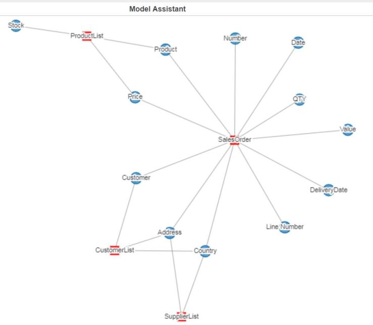
This diagram shows the common elements in all the reports. Thus you can see that the attributes and facts that will need modelling. It has some misleading features – the address for the supplier and customer is unlikely to be really common, and might come from different tables – but it’s a much clearer way of transforming a set of requirements into an intermediate form that you can review with the customer. For instance:
| Report | Element |
| SalesOrder | Date |
| SalesOrder | Number |
| SalesOrder | Customer |
| SalesOrder | Address |
| SalesOrder | Country |
| SalesOrder | Value |
| SalesOrder | DeliveryDate |
| SalesOrderLine | Number |
| SalesOrderLine | Line Number |
| SalesOrderLine | Product |
| SalesOrderLine | QTY |
| SalesOrderLine | Price |
| CustomerList | Customer |
| CustomerList | CustomerAddress |
| CustomerList | Country |
| SupplierList | SupplierAddress |
| SupplierList | Country |
| ProductList | Product |
| ProductList | Price |
| ProductList | Stock |
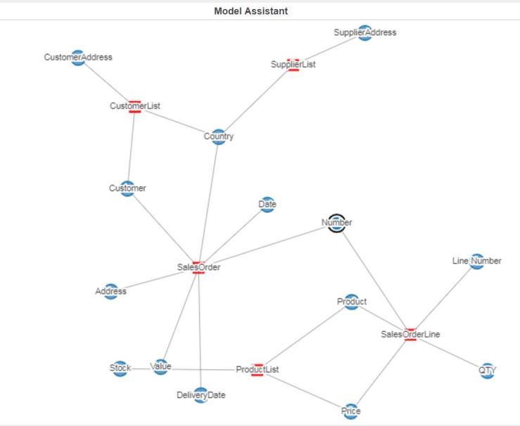
In the revised table above, the elements in bold are new. The fact that there are a number of order lines per order is recognised, as well as the supplier and customer addresses being different. After a refresh of the visualisation:
You can then refine the model and refresh the MicroStrategy Dossier. With Vitara Charts, you can build the logical model – the schema – and visualise it using the Org Chart visualisation (image coming soon, I need to refresh the vitara license on my setup).
I can then build a similar table with the elements, and the columns from the physical tables that contain the data. Similarly, I can visualise it with a Network Diagram, and I can iterate this process until the model reaches completion (if not perfection, there’s always refinements and unforeseen challenges).
Finally, within the same dossier, I can have a set of visualisations and lists which document the transformation from reporting elements to schema, in an easily shareable and transmissible format.
I find it elegant to use MicroStrategy to create the constructs that will configure MicroStrategy so that the customer’s requirement can be implemented. It is this completeness of vision, the whole journey without dead ends, which I find so compelling with this product.
Why don’t you have a go ?
I wanted to acknowledge my colleague Sachit Vinod, who came up with this visualisation idea when we worked together on a Business Objects conversion exercise. The use of the network chart, for me, was a revelation, and I am very grateful to him for the insight.

You must be logged in to post a comment.