
We talk about data a lot in my line of work, but actually what we really communicate with is information. Data in its raw state is an ingredient. The combination of various data points blends the ingredients into recipes that satisfy many different needs: Learning, communicating strategy, understanding relationships are but a few of the uses we have for organised information.
You’ll have gathered, looking at my other posts, that I like to use maps in my data visualisations – that’s because I love maps and it really helps me to build a mind palace, a la Sherlock Holmes, to hold all the relevant information about the main subject of my explorations, the study of populations and the various data points we can use to classify groups of people based on geography.
It’s perfectly possible that this does not work for other people. My mind is particularly receptive to maps and networks, but it may be that other minds function differently.
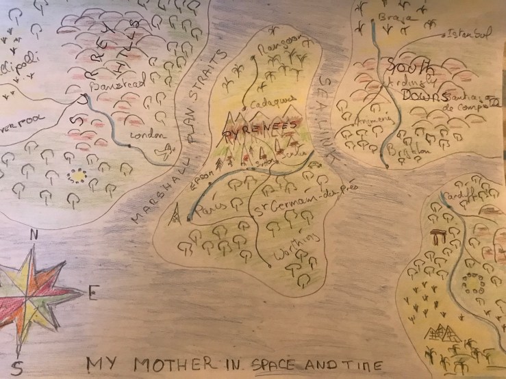
This article is about my discovery of maps as a device to plot family history, describe family gatherings or simply remember voyages or places of significance. Following the passing on of my mother this year, I found myself drawing map after map of people and places to put my mother in a spatial and temporal context. I then started doing this for other family members, for places I went on holiday or where a number of family interactions were taking place, such as Cardiff or the numerous ways of crossing the Channel, an activity my family has been doing for as long as I have been alive.
It all began as a game I made up to entertain a grandchild on the threshold of boredom. I talked about the maps of fantasy worlds, such as Middle Earth, and proposed to make up a map where all the grand-children would be represented as places or geographical features (lakes, seas, mountains, cities, ports, islands…). This we did and I was very pleased with the result: this map could be used to weave countless stories, real and imagined, and provided, for those who understood the symbols, a condensed picture of a complex network of places, people and times.
More maps followed in short order. I mapped my sister’s familyscape in Cardiff, and that of my brother. Each iteration brought a slow standardisation of symbols: in my brother’s map, he is represented by a river system that connects all points, for instance.

These maps are imaginary in that they have absolutely no actual geographical accuracy. The people, places and events are real, but tend to exist in a framework either dependent on time, as when mapping someone’s life, or on relationships when mapping a family or a group (all the grandchildren, for instance).
Another class of maps that I draw have a more geographical basis, in that they assist me with remembering special places and anchoring the memories, or the stories, to actual real-world locations that others, should they be interested, could visit to see if a shared experience is possible.
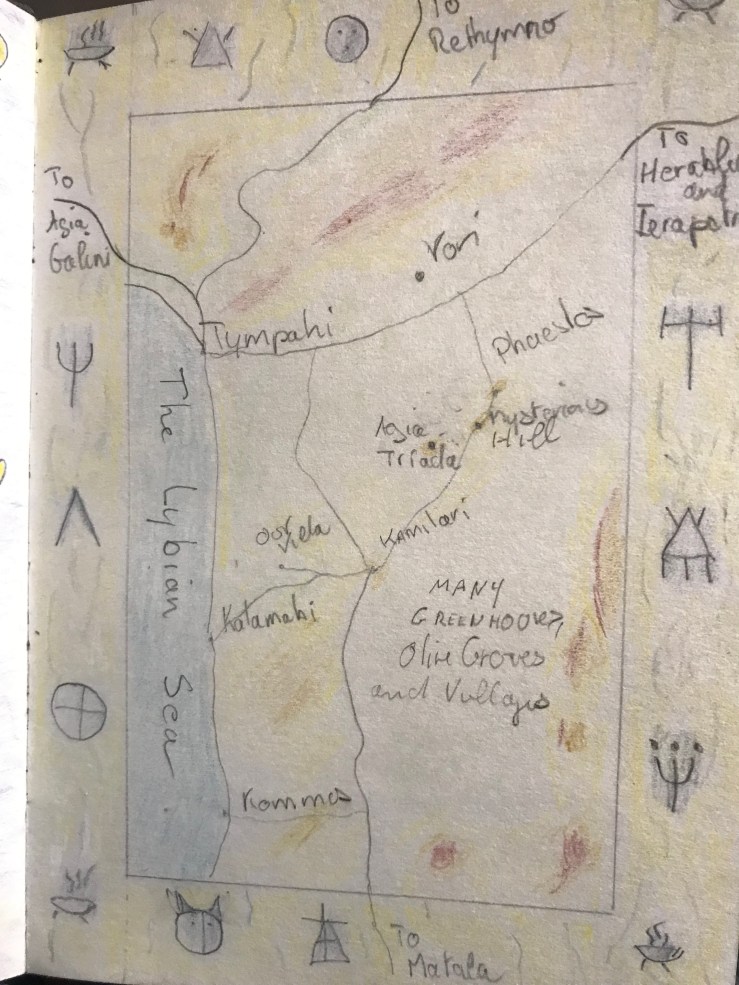
I don’t think it matters that the artistry is poor. I’m sure it will improve over time as I practice – the important thing is to get the map down so that the memories attached to the place have a visual support.

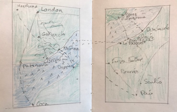
So we’ve talked about places and groups of people – you’ll see that a mapping language is slowly being developed to codify memories and relationships. The last topic that is, in my opinion, mappable, is the mindset. In this article’s context, a mindset is a combination of places and events which relate to a particular thought. For instance, providing an image of all the possible ways you can travel from France to the UK and vice-versa as shown in the map below.
So here is the proposition. I’ve used this mapping system for personal explorations and this has allowed me to provide starting points for a considerable amount of memories and stories.
Would it be possible to evolve a data communication language that would have business intelligence systems provide starting points for complex stories, using cartographical methods to represent individuals, networks, places and events ?
A conversation I had with one of my colleagues was that, when it came down to it, bar charts and line charts were really the only visualisations that conveyed information clearly. Complex visualisations, whilst flattering the ego of the creator, are tricky to use without a detailed explanation.
But assume that a common language evolves with the ability to be mapped, and that everyone becomes familiar with the metaphors employed, and you’d get the start of a new way of interacting with information, and of communicating it.
It’s worth a try…

You must be logged in to post a comment.